Updated Statistics & Customizable Trend Graphs: https://buckystats.org
https://odysee.com/dec-9-cdc-expected-vs-excess-deaths-dry-tinder-hypothesis-estimates-maryland-pennsylvania-us:12e3f2ccb1ecc826e1fba570c1fce54c0e5600c8
https://www.youtube.com/watch?v=Mvd7_nczkjE
When I was digging through CDC data in October, I very much wanted to work with their numbers for their weekly “threshold for excess deaths”. That is the orange line on their excess deaths graph with Weekly number of deaths (from all causes). But I was not able to find it within their export options. Please let me know if you have found this data, because I was desperate enough to approximate answers another way.
I took screenshots of the CDC graphs for Maryland, Pennsylvania, and the United States. Then I drew a few complex polygons in GIMP to create areas in between the orange line “threshold for excess deaths” and the centers of each blue bar.
The areas in lighter green (below the line) represent how many fewer deaths were observed than expected. Many researchers have used the phrase “dry tinder” to describe these people who lived longer than the CDC expected (almost every week for the three years before this pandemic was declared).
The areas in darker green (above the line) represent excess mortality, meaning the all-cause death counts were above the CDC’s threshold of the orange line. Then I used GIMP’s histogram tool, selected one color at a time, and calculated how many pixels each color covered.
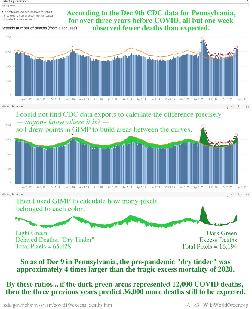
Completing this process for the CDC’s Pennsylvania graph, I found 4 times more pixels below the orange threshold line, than above the line. So compared to the spike of excess mortality in 2020 in Pennsylvania, there might have been 4 times as many expected deaths avoided throughout the previous three years.
Next, I wanted to try applying those ratios to the reported excess death numbers. So as another back of the envelope estimate, we could associate the dark green areas with the almost 12,000 total COVID-related deaths reported in Pennsylvania. That would mean the light green area represents around 48,000 people, only 12,000 of whom died this year. So on a four-year time span, 36,000 more ‘dry tinder’ deaths are still expected to balance out the CDC’s predictions.
If this CDC data is accurate, then these circumstances were all baked into the cake before SARS-CoV-2 was declared a pandemic.
Completing this process for the CDC’s Maryland graph, I found 3.6 times more pixels below the orange threshold line, than above the line. So compared to the spike of excess mortality in 2020 in Maryland, there might have been 3.6 times as many expected deaths avoided throughout the previous three years.
So as part of this thought experiment, we could associate the dark green areas with the almost 5,000 total COVID-related deaths reported in Maryland. That would mean the light green area represents around 18,000 people, only 5,000 of whom died this year. So on a four-year time span, 13,000 more ‘dry tinder’ deaths are still expected to balance out the CDC’s predictions.

Running the same process once more for the whole United States… I found 1.5 times more pixels below the orange threshold line, than above the line. So compared to the spikes of excess mortality in 2020 in the U.S., there might have been 1.5 times as many expected deaths avoided throughout the previous three years.
So we could associate the dark green areas with the almost 300,000 total COVID-related deaths reported in the United States thus far. That would mean the light green area represents around 450,000 people, only 300,000 of whom died this year. So on a four-year time span, 150,000 more ‘dry tinder’ deaths are still expected to balance out the CDC’s predictions.

Added December 29 for more context…
CDC’s 2007 “Interim pre-pandemic planning guidance : community strategy for pandemic influenza mitigation in the United States : early, targeted, layered use of nonpharmaceutical interventions”

I failed to find any compelling evidence within the state of Maryland’s communications on lockdowns, etc. After sending my formal information request in May, I started looking for CDC recommendations and studies likely shared with the governor’s office. I quickly stumbled upon this document, which seems to prove just how unprecedented this year’s policies are. I haven’t had time to finish a blog post around the CDC’s Pandemic Severity Index, but here is the image I created from the content on pages 10-11.
This document has been superseded by their 2017 version, which has a much more complex Severity Index. But by very clear 2016 CDC standards, most governors’ policies this year would not have been recommended.
2007: https://stacks.cdc.gov/view/cdc/11425
2017: https://stacks.cdc.gov/view/cdc/45220
* Scaled to 2019 population estimates, these CDC categories’ mortality boundaries would be around…
1: < 98,235
2: 98,235 – 491,175
3: 491,175 – 982,350
4: 982,350 – 1,964,700
5: > 1,964,700
As of Dec 29, the IMHE models forecast around 567,000 American deaths by April 1: https://covid19.healthdata.org/united-states-of-america.
I would not make life and death decisions based on CFR estimates. Here one source summarizing how uncertain they are. If trying to read this Severity Index with the CFR, then the CDC’s June estimates for the 2020 pandemic place it anywhere between Category 2 and 5 (statistically useless):
https://wwwnc.cdc.gov/eid/article/26/6/20-0320_article
Abstract: “We estimated the case-fatality risk for coronavirus disease cases in China (3.5%); China, excluding Hubei Province (0.8%); 82 countries, territories, and areas (4.2%); and on a cruise ship (0.6%). Lower estimates might be closest to the true value, but a broad range of 0.25%–3.0% probably should be considered.”
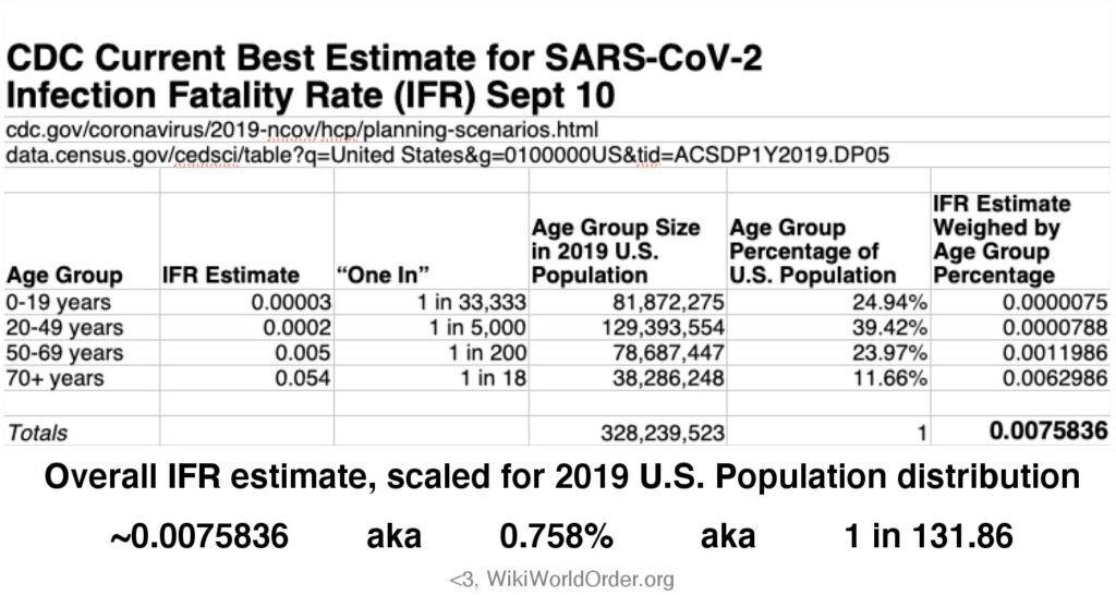
Quick Fact Check: CDC Best Estimate for Infection Fatality Rate (IFR)
0-19 years: 0.00003
September 10, https://www.cdc.gov/coronavirus/2019-ncov/hcp/planning-scenarios.html
20-49 years: 0.0002
50-69 years: 0.005
70+ years: 0.054
Since they don’t seem to do this for me, I’ve taken the liberty to scale these estimates to a 2019 U.S. population distribution. This resulted in an estimate for the overall IFR in the U.S. as 0.0075836, aka 0.758%, aka 1 in 131.86.
More on COVID…
WHO Killed The 20-21 Seasonal Flu?, Dec 9
Oct 21, Maryland-Centric COVID-Related Mortality Rankings, Dec 5
Governor Hogan Information Request: Followup Voicemail #1, Dec 4
A Few Weird Memes For 2020, Dec 3
Historical Mortality Data Update (COVID-USA), Oct 15
Science Denial? Rights Denial?, May 28
Drug Use and Pandemics as Public Health Issues, May 28
Governor Hogan’s Science-Based Health Policies: An Information Request Experiment, May 20
Revisiting Imperial Risk Assessments of COVID-19, May 13
Risk Assessment Update May 10 on U.S. COVID-19 Deaths, May 10
Franklin D. Roosevelt on Familiar Fascism, Apr 25
Clade X Quotes: The Governors’ Pandemic, Apr 23
Double-Edges of Exponential Scientism, Mar 29
Updated Statistics & Customizable Trend Graphs:
