Updated Statistics & Customizable Trend Graphs: https://buckystats.org
CDC Observational Data compared with approximations of Imperial College Model Projections from March 16
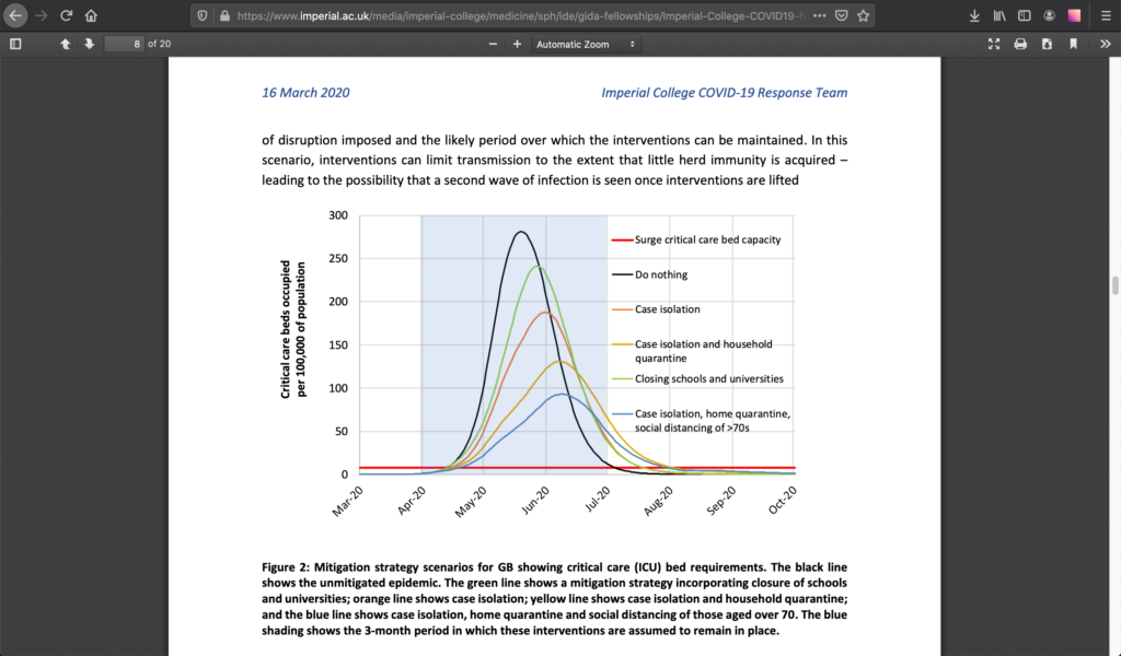
On March 16, 2020, the London “Imperial College COVID-19 Response Team” led by Neil Ferguson published their “Report 9: Impact of non-pharmaceutical interventions (NPIs) to reduce COVID-19 mortality and healthcare demand”. This report was very widely shared on mainstream media, social media, and by policymakers. I interpreted this report to be a primary driver of the atmosphere under which policy discussions are still limited.
I’ve been wondering how their model projections have corresponded to the observational data we have thus far. Unfortunately, they do not provide predictions in any formats that can be readily matched with what little data is actually reported by the CDC, etc. Perhaps models intended to inform public policy should always predict specific hard measurements over time for later comparison. How else can policymakers and voters verify the accuracy or efficacy of a given policy?
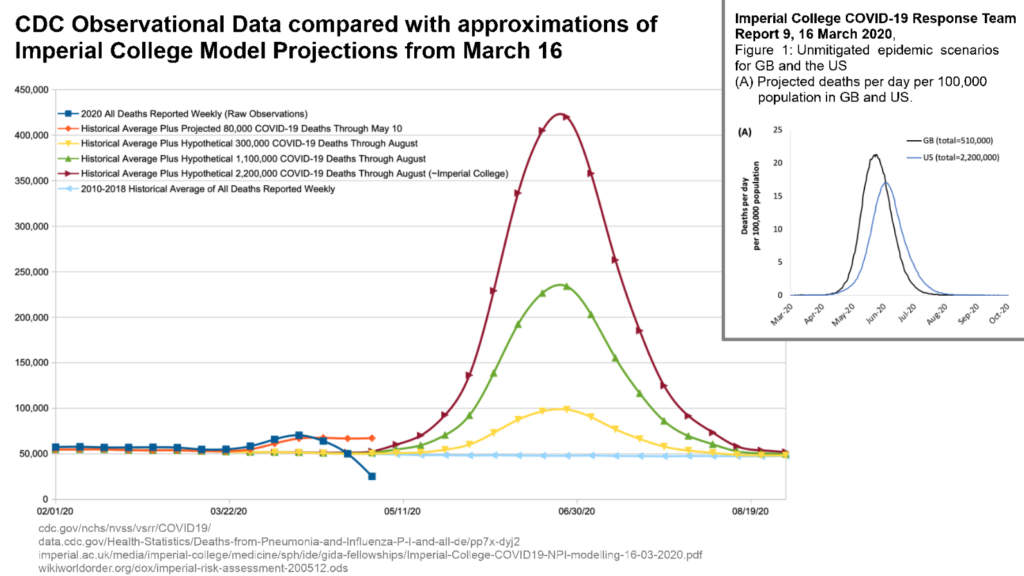
So for my next thought experiment, I have graphed a few hypothetical projections on top of the 2010-2018 Historical Average of All Deaths Reported Weekly. In this graph, the dark blue line on top is the raw observational data for All Deaths Reported Weekly in 2020 as of May 8. The most recent few weeks in that observational data are clearly missing a lot of reports because the WorldOMeters website has reported over 80,000 COVID-19 deaths in the U.S. cumulatively. So I’ve manually constructed the orange line as a projected/artificial/fabricated/fake set of COVID-19 deaths which represents the ballpark shape of 80,000 Excess COVID-19 Deaths through May 10 — stacked on top of the Historical Average of All Deaths Reported Weekly.
Next, I constructed a hypothetical curve close to the Imperial College’s Projected COVID-19 Deaths if they were reported weekly. With ample trial and error, I was able to roughly simulate the time frame (May~August) and peak intensity with my curve, while getting the area under the curve to total 2,200,000 American deaths from COVID-19. I then scaled this same curve to also simulate 1,100,000 and 300,000 deaths occurring before the end of August. Each of these Projected Excess COVID-19 Weekly Death simulations was then stacked on the Historical Average of All Deaths Reported Weekly for the accurate reference.
Data Sources:
https://www.cdc.gov/nchs/nvss/vsrr/COVID19/
https://data.cdc.gov/Health-Statistics/Deaths-from-Pneumonia-and-Influenza-P-I-and-all-de/pp7x-dyj2
https://www.imperial.ac.uk/media/imperial-college/medicine/sph/ide/gida-fellowships/Imperial-College-COVID19-NPI-modelling-16-03-2020.pdf
My Math & Hypotheticals:
http://worldorder.wiki/dox/imperial-risk-assessment-200512.ods
What This Graph Says To Me (My Opinion)
My primary motivation in exploring these data was to visualize the accuracy thus far from the ‘consensus’ pandemic growth models. There is no objective reality in which COVID-19 should maintain the panicdemic status it attained in March — let alone promises of future lock-downs.
With the data thus far, I still find it fantastical to believe that the mitigation policies implemented by listening to [specific] scientists brought reality down to the orange line from the red line or even the green line. I can entertain evidence-based claims that totalitarian policies plausibly brought us down from the yellow line to the orange line.
The policies were based on the premise of the red or green lines, and in all likelihood, the virus is an order of magnitude less deadly.
I did this because I hadn’t seen anyone else attempt to overlay the Imperial College curve with observational data. The thing I did not expect to notice was how much later the peak was predicted to hit — around the start of July. But many countries already passed their peak as of May 10. Presumably, the U.S. is having a tragically longer plateau — a sign to me that our policies are not very effective, or we have significantly worse co-factors.
Offhand, this timing offset seems to increase the likelihood that COVID-19 had been spreading earlier than November and/or that it had already spread faster than previously estimated by March. If the virus is dramatically more widespread, then it must have a dramatically lower Infection Fatality Rate. This aligns with other studies estimating this Infection Fatality Rate to be between 0.2~0.6% instead 1~3%+.
By definition, non-linear models for complex chaotic systems are sensitive to initial conditions. Imperial College was of course working with highly inaccurate sensitive inputs. This extreme margin of error is an example of why we should never give up so many rights for claims with so much uncertainty.
Another data mismatch relates to hospital capacity. The whole point of these policies was to “flatten the curve” so that the hospitals didn’t get slammed, causing extra excess deaths from that secondary threat. But relatively few hospitals ever got slammed, and more are now struggling from being too empty. If COVID-19 is in fact an order of magnitude less deadly than thought in March, then these policies are even less justified. These policies delay more deaths than they ‘prevent’. The world is stuck with this virus, so any policies need to be sustainable absent a ‘cure’.
It’s worth noting that last week, Imperial Team leader Neil Ferguson resigned, regrettably “undermining” the messages on social distancing with visits to his lover. His actions do not seem to fit with the risks he helped define. Do as I say, not as I do.
It also seems worth noting that in March of 2020, the Bill & Melinda Gates Foundation gave a $79,006,570 grant to the Imperial College of London for a global health program to “to develop a new tool for malaria control and elimination in sub-Saharan Africa”.
And I can’t help but mention one more dimension of chess… Definitions for “Imperial” include “of, like, or pertaining to an empire” and “characterizing the rule or authority of a sovereign state over its dependencies.” The Anglo-American Empire has instigated and [thus far] dominated the growth of global governance. “Global governance” is one of the few guaranteed winners fueled by this crisis. Nobody has explained to me how global governance will form to be less dangerous to the world than our less centralized corporatocracies. We generally need to master governing ourselves before thinking about governing others.
Open society back up now, while focusing on:
- Protecting nursing homes, assisted living, and other vulnerable populations
- Repairing those with lives destroyed by the reactions to the virus
Make American [Partially] Free Again
Some related videos I recommend…
Cross-Posted:
https://medium.com/@wikiworldorder/revisiting-imperial-risk-assessments-of-covid-19-may-12-503f76eeab82
https://steemit.com/politics/@wikiworldorder/revisiting-imperial-risk-assessments-of-covid-19-may-12
Updated Statistics & Customizable Trend Graphs:
