Updated Statistics & Customizable Trend Graphs: https://buckystats.org
Dec 5 Update - I finally recorded a video with a less polished talk-through of this data, as I see it:
As of October 15, I have still not received any replies from Governor Hogan’s office to my formal information request sent in late May. “Most specifically, I am requesting a list of public health studies that informed policies ordering “all non-essential businesses and other establishments” [close], and “requiring all persons to stay at home” outside of essential needs (Order Number 20-03-30-01).”
Over recent months, I have researched many deeply troubling topics related to the COVID-19 pandemic. But for now, here are some fresh collections of raw data which I wanted to inform my opinions and risk assessments on our collective situation.
All data presented here is from the CDC and/or the Census Bureau — except the mortality and population data for Maryland before 1968, which came from the MD Department of Health. I would love to find similar historical data for D.C., Florida, and Arizona, if anyone can find them. I have done my best to get this 100% accurate, but please feel free to check my work and offer any corrections.
Spreadsheets for these graphs:
worldorder.wiki/dox/covid-data-october-2020.ods
United States
Figure US-1: United States All Cause Mortality, as Crude Percent of Population, 1900-2020
2020 mortality is graphed here as Sept ’19 through Aug ’20, with a record high 3.1 million deaths, or 0.94% of the population. According to the CDC, 2020 is United States’ deadliest year since this level was a new low in 1970.
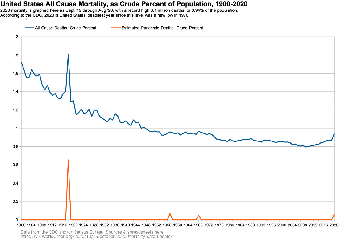
Figure US-2: United States All Cause Mortality, as Crude Percent of Population, by Age Group, 1968-2020
For 85+ year olds in the U.S., 2020 is the most deadly year since 2005.
For 75-84 year olds in the U.S., 2020 is the most deadly year since 2013.
For 65-74 year olds in the U.S., 2020 is the most deadly year since 2008.
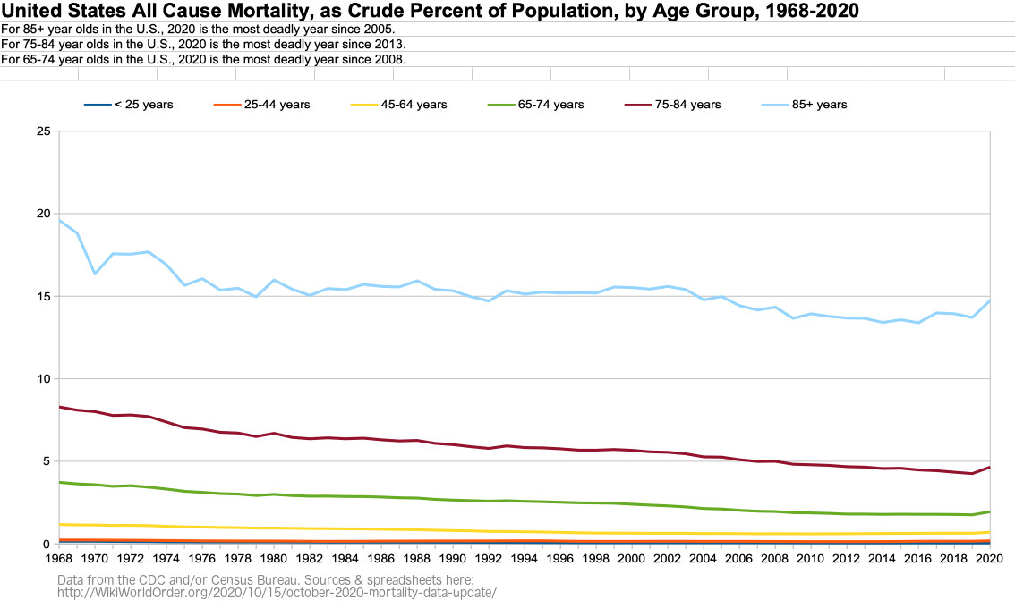
Figure US-3: United States Age Groups as Percent of Population, 1968-2020
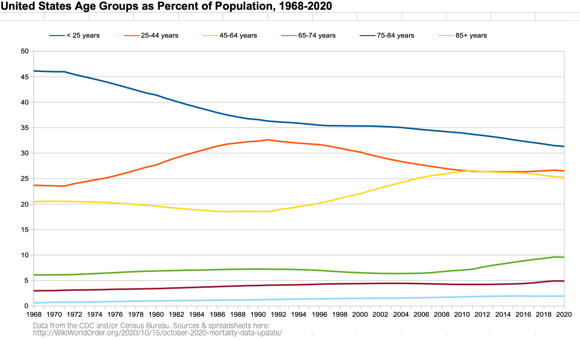
Figure US-4: Weekly U.S. All Cause Mortality, Crude Rate Per Million, Sept-Aug 2015-2020
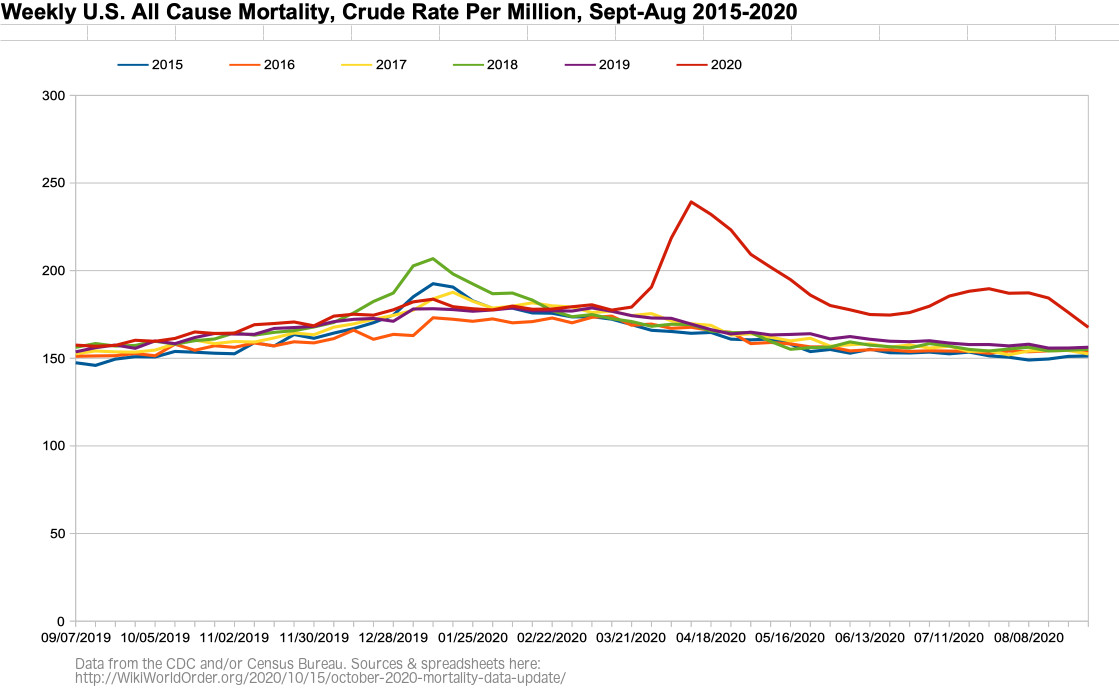
Figure US-5: Weekly U.S. All Cause Mortality, Crude Rate Per Million, Sept 2019 – Aug 2020
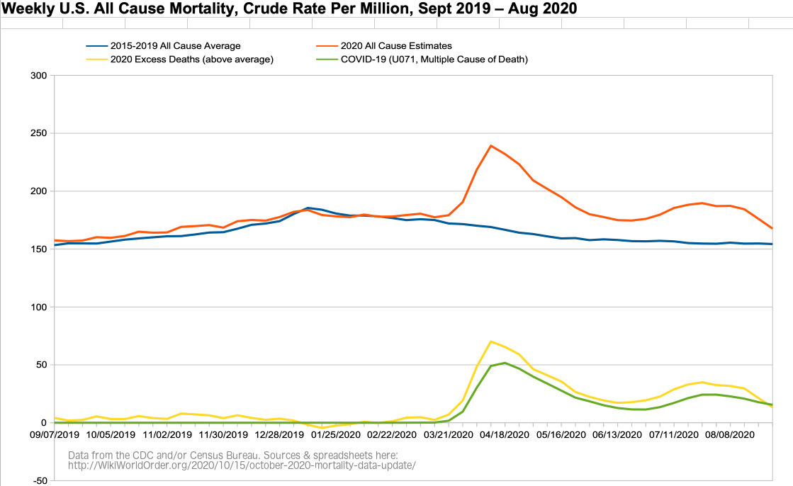
Figure US-6: Weekly U.S. All Cause Mortality VS Imperial College Model, Crude Rate Per Million, Sept 2019 – Aug 2020
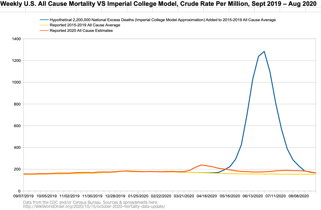
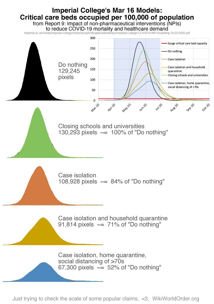
Figure US-6b: Figure US-6 with the Imperial College’s March Graphed Projections of “Critical care beds occupied per 100,0000 of population” with Different Interventions (graph added Dec 11)
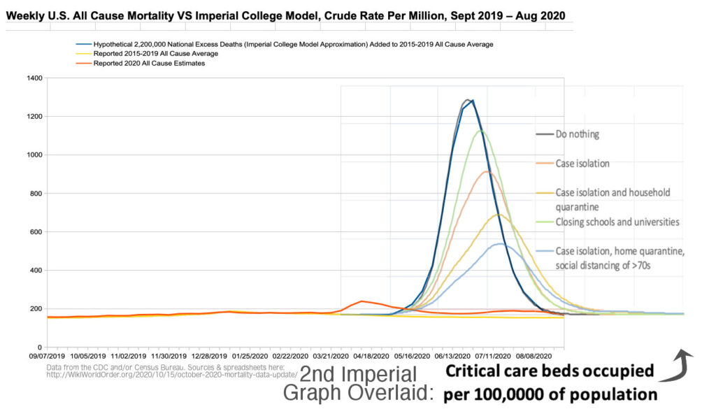
Figure US-6c: Figure US-6 with the Imperial College’s March Graphed Projections of “Critical care beds occupied per 100,0000 of population” with Different Interventions on Reported Data (graph added Dec 11)
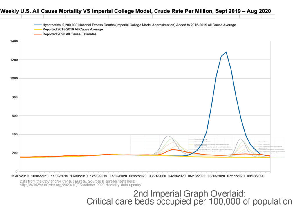
Figure US-7: Weekly U.S. Number of Deaths, Excess and Expected (CDC screenshot)
(Related to “dry tinder” hypothesis.)
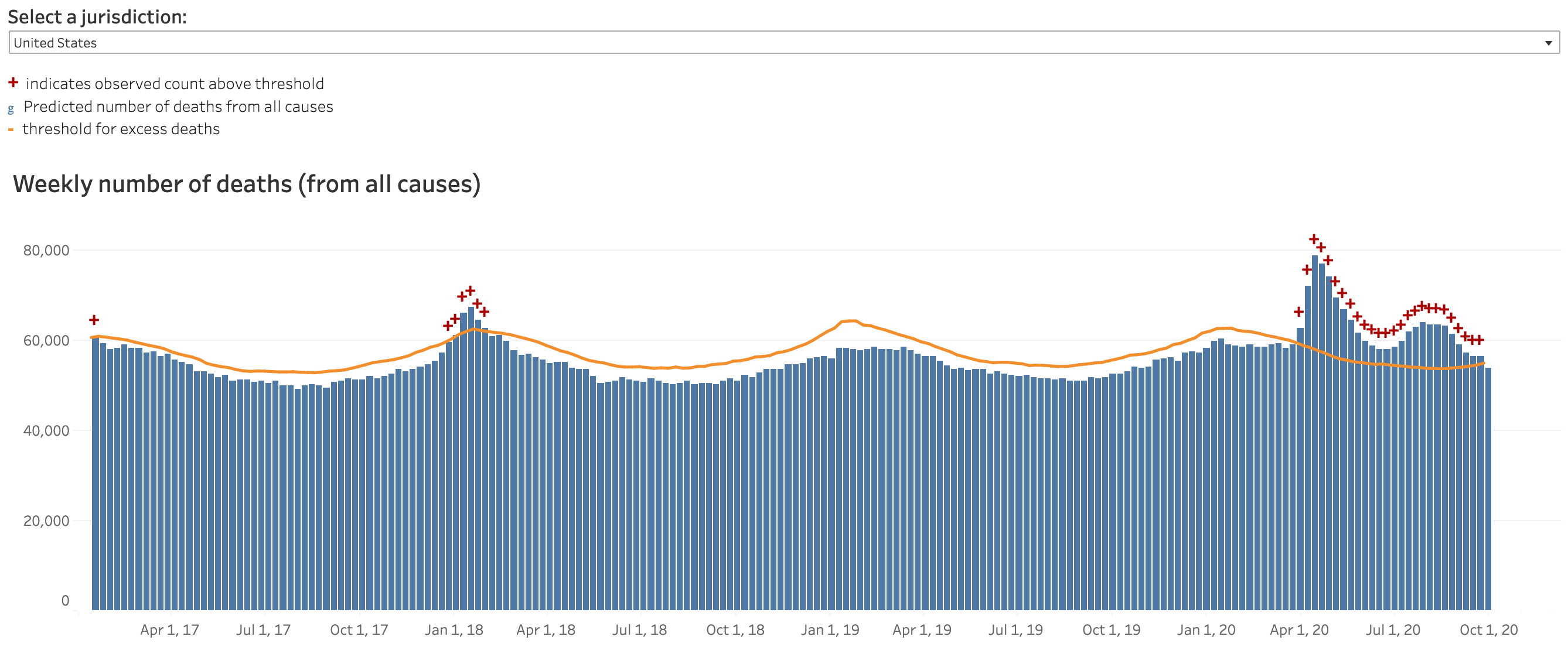
Dec 10 Update: CDC Expected vs Excess Deaths — “Dry Tinder” Hypothesis Estimates for Maryland, Pennsylvania, and the U.S. as a Whole
Figure US-8: Daily New Cases in the United States (WorldOMeters.info screenshot)
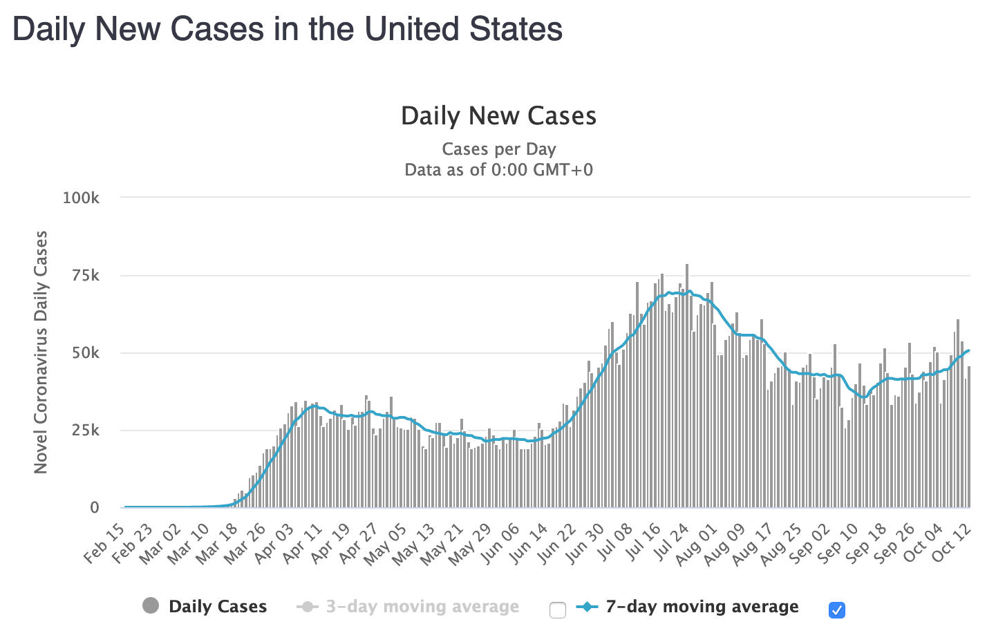
Figure US-9: Daily New Deaths in the United States (WorldOMeters.info screenshot)
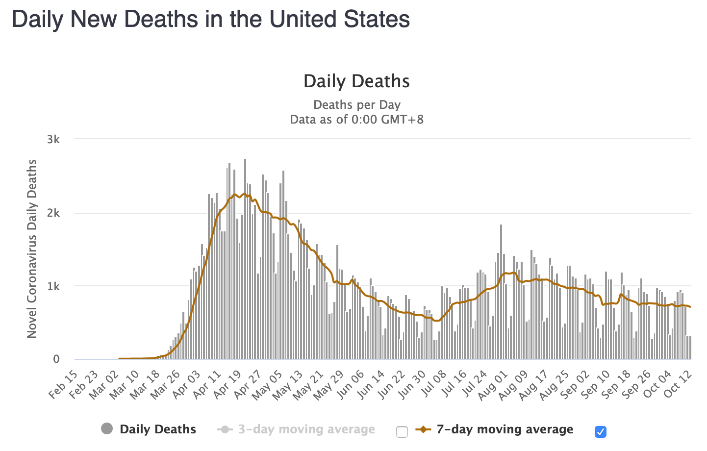
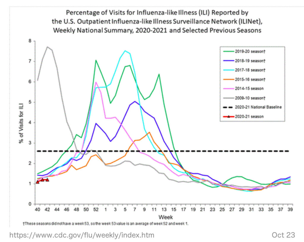
Figure US-10: Outpatient Illness Surveillance (ILINet)
After gathering this data for the United States as a whole, I ran the numbers for four~states. I might do more states in the future, when I attempt to indicate policy interventions for a few case studies.
Maryland
Figure MD-1: Maryland All Cause Mortality, as Crude Percent of Population, 1902-2020
2020 mortality is graphed here as Sept ’19 through Aug ’20, with a record high 55,860 deaths, or 0.92% of the population. According to the CDC, 2020 is Maryland’s deadliest year since this level was a new low in 1953.
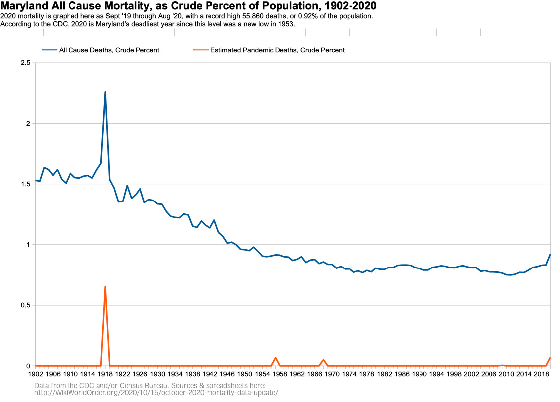
Figure MD-2: Maryland All Cause Mortality, as Crude Percent of Population, by Age Group, 1968-2020
For 85+ year olds in Maryland, 2020 is the most deadly year since 2003.
For 75-84 year olds in Maryland, 2020 is the most deadly year since 2011.
For 65-74 year olds in Maryland, 2020 is the most deadly year since 2008.
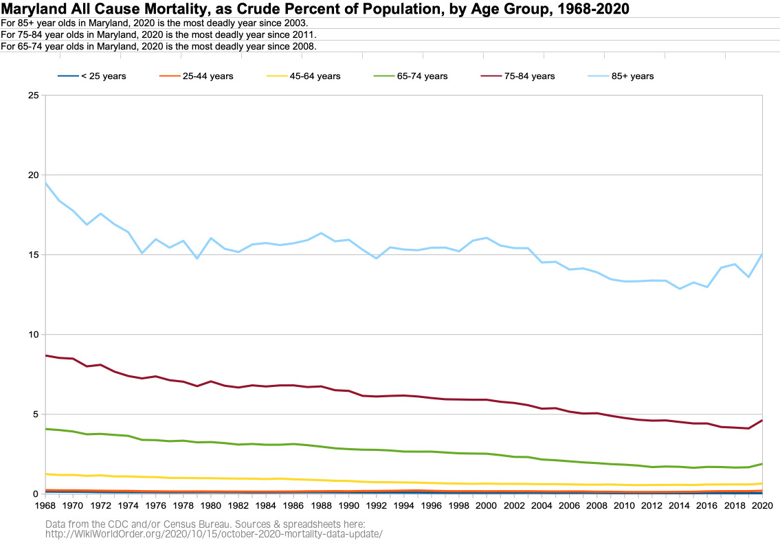
Figure MD-3: Maryland Age Groups as Percent of Population, 1968-2020
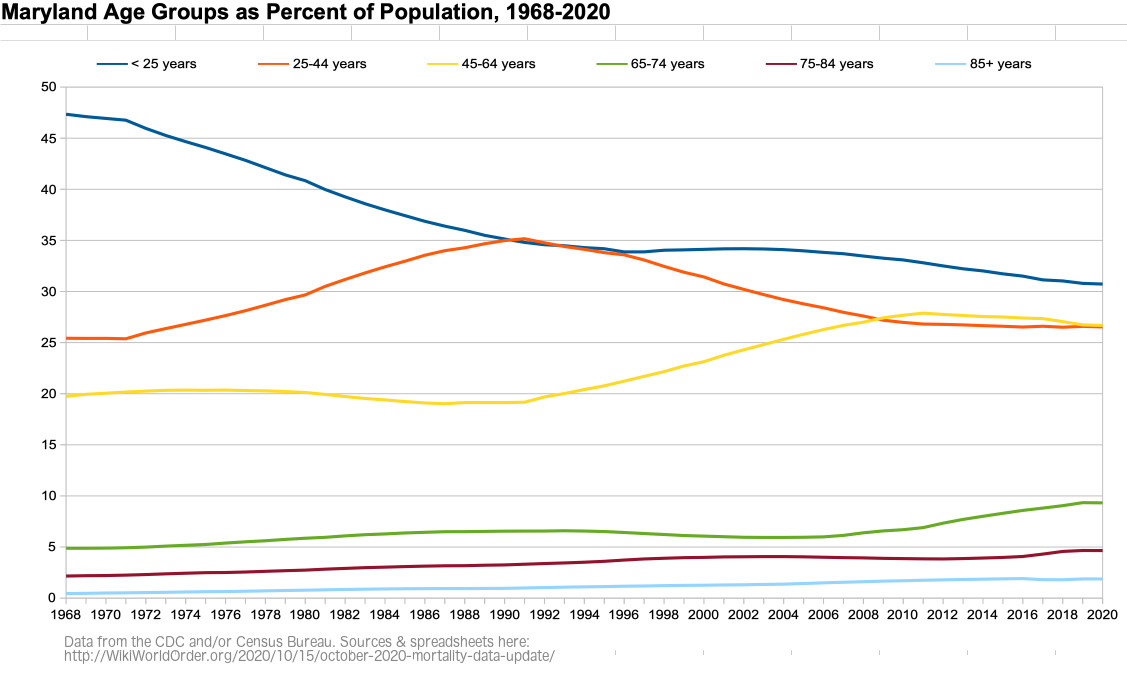
Figure MD-4: Weekly Maryland All Cause Mortality, Crude Rate Per Million, Sept-Aug 2015-2020
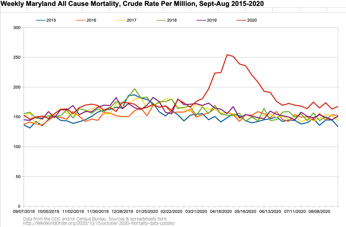
Figure MD-5: Weekly Maryland All Cause Mortality, Crude Rate Per Million, Sept 2019 – Aug 2020
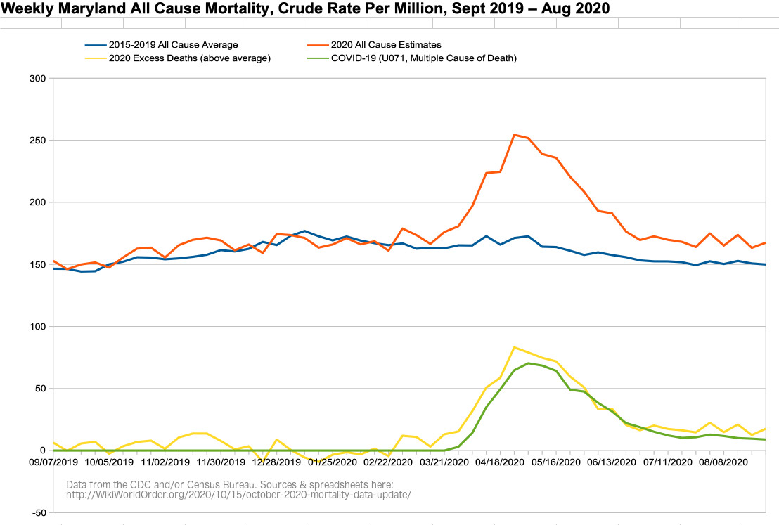
Figure MD-6: Weekly Maryland All Cause Mortality VS Imperial College Model, Crude Rate Per Million, Sept 2019 – Aug 2020
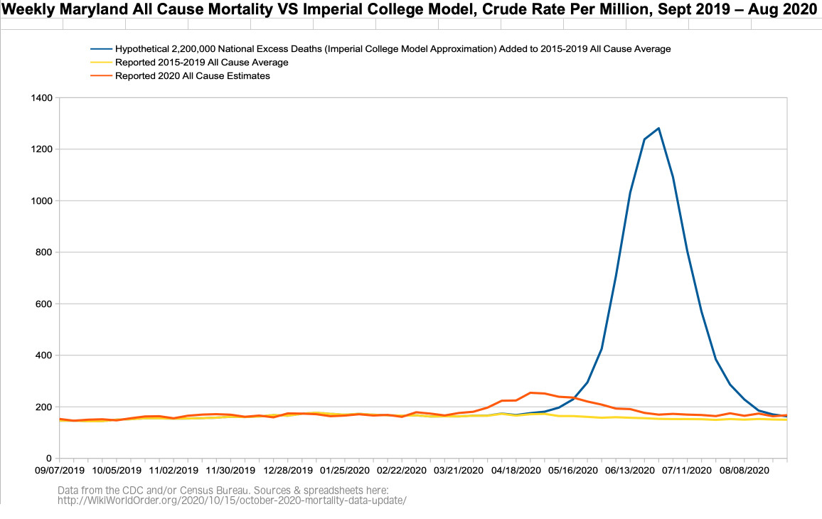
Figure MD-6b: Figure MD-6 with the Imperial College’s March Graphed Projections of “Critical care beds occupied per 100,0000 of population” with Different Interventions (graph added Dec 11)
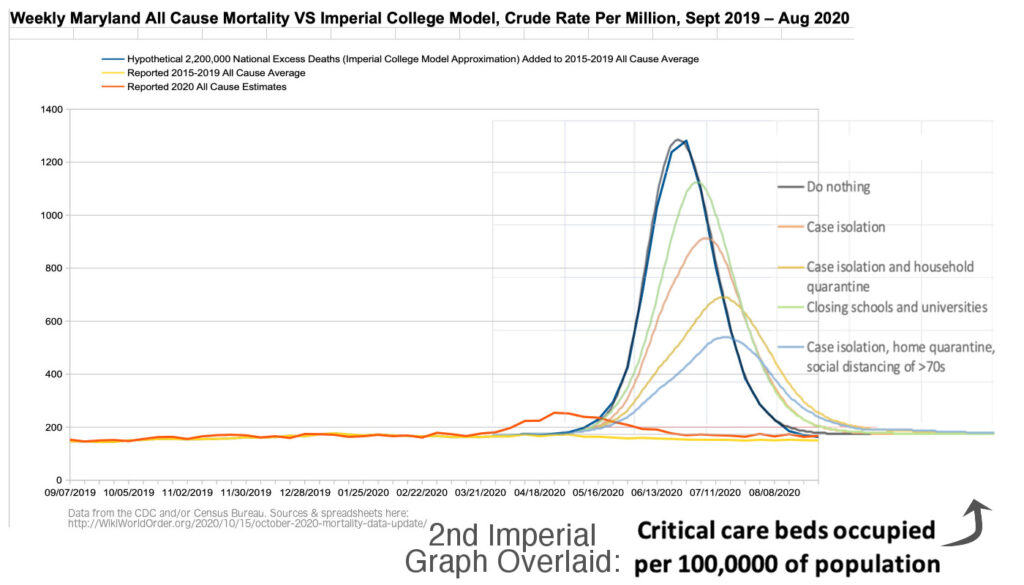
Figure MD-6c: Figure MD-6 with the Imperial College’s March Graphed Projections of “Critical care beds occupied per 100,0000 of population” with Different Interventions on Reported Data (graph added Dec 11)
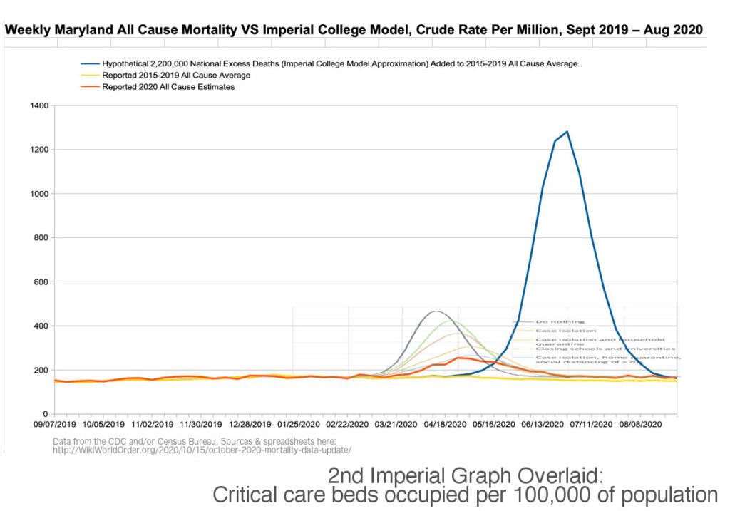
Figure MD-7: Weekly Maryland Number of Deaths, Excess and Expected (CDC screenshot)
(Related to “dry tinder” hypothesis.)
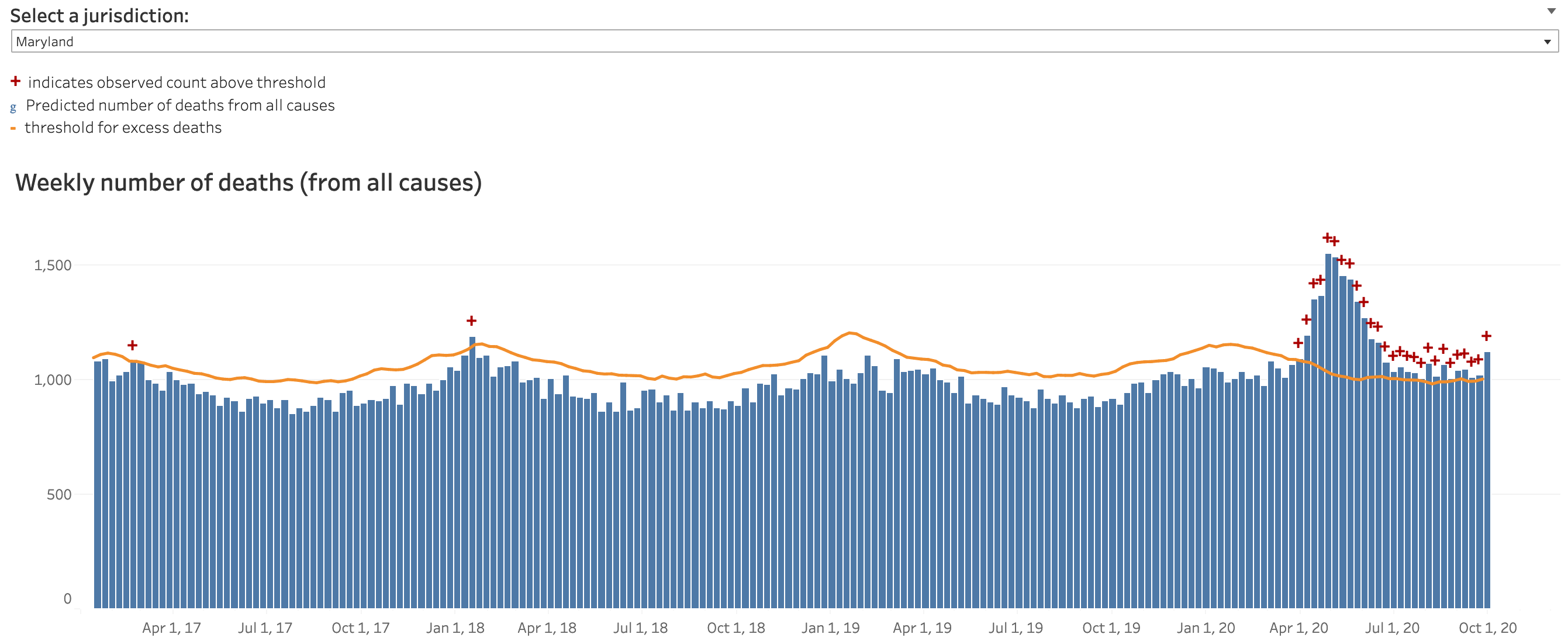
Dec 10 Update: CDC Expected vs Excess Deaths — “Dry Tinder” Hypothesis Estimates for Maryland, Pennsylvania, and the U.S. as a Whole
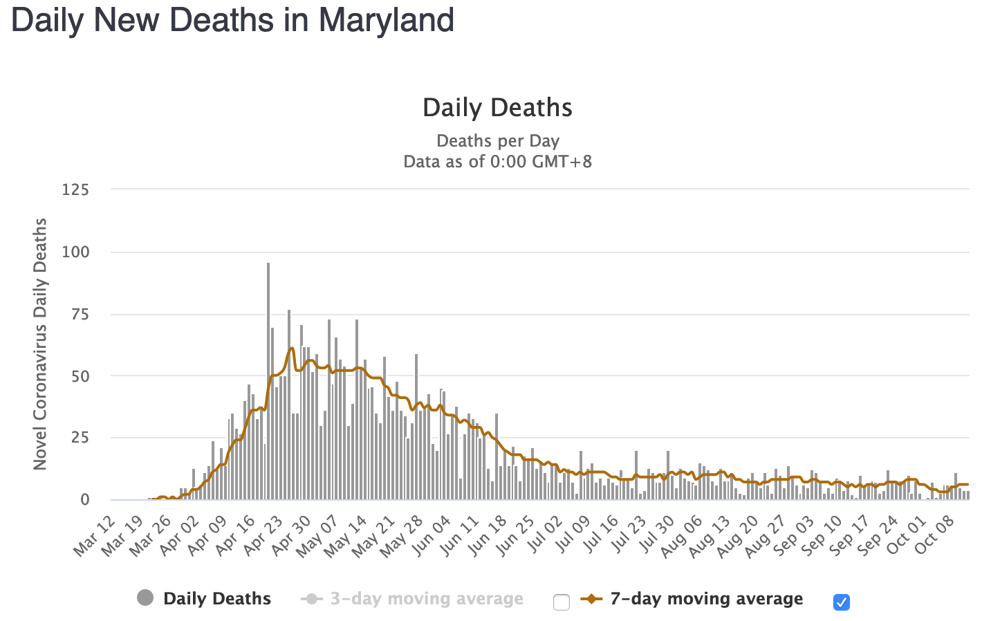
Figure MD-8: Daily New Cases in Maryland (WorldOMeters.info screenshot)
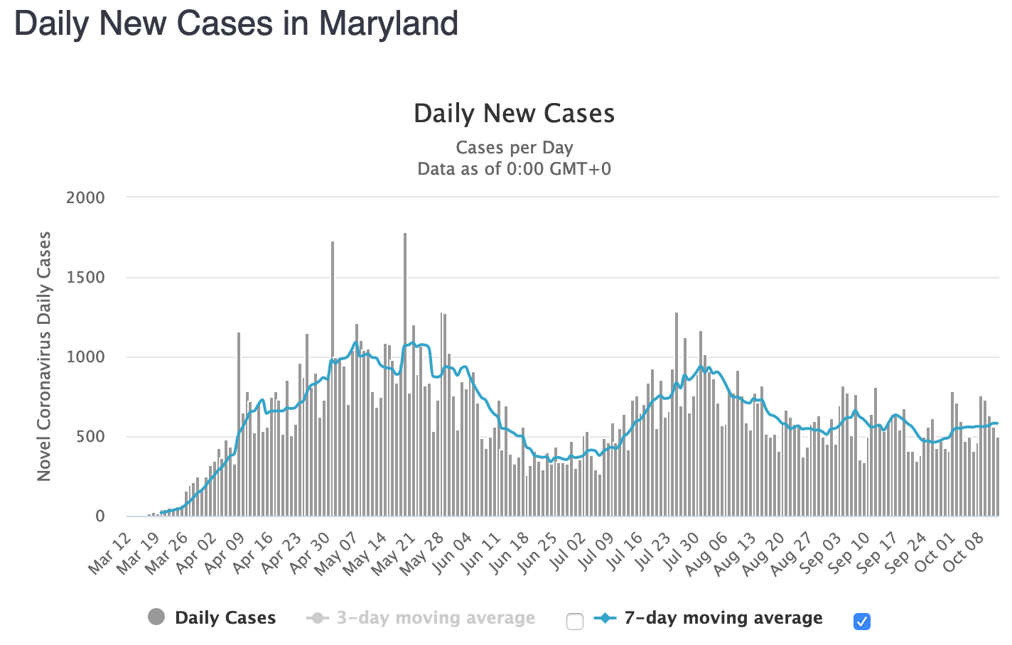
Figure MD-9: Daily New Deaths in Maryland (WorldOMeters.info screenshot)
(Recently in “Casedemic” territory.)
District of Columbia
Figure DC-1: District of Columbia All Cause Mortality, as Crude Percent of Population, 1910-2020
2020 mortality is graphed here as Sept ’19 through Aug ’20, with a record high 7,164 deaths, or 1.00% of the population. According to the CDC, 2020 is the District’s deadliest year since this level was a new low in 2002.
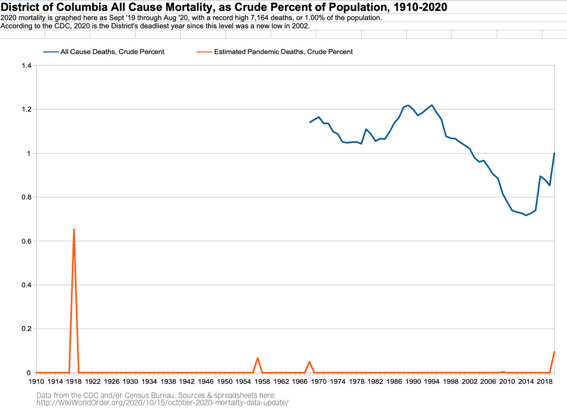
Figure DC-2: District of Columbia All Cause Mortality, as Crude Percent of Population, by Age Group, 1968-2020
For 85+ year olds in DC, 2020 is the most deadly year approximately since 2000.
For 75-84 year olds in DC, 2020 is the most deadly year since 2006.
For 65-74 year olds in DC, 2020 is a slightly deadlier year than the most recent peak in 1988.
For 45-64 year olds in DC, 2020 is the most deadly year since before 1968.
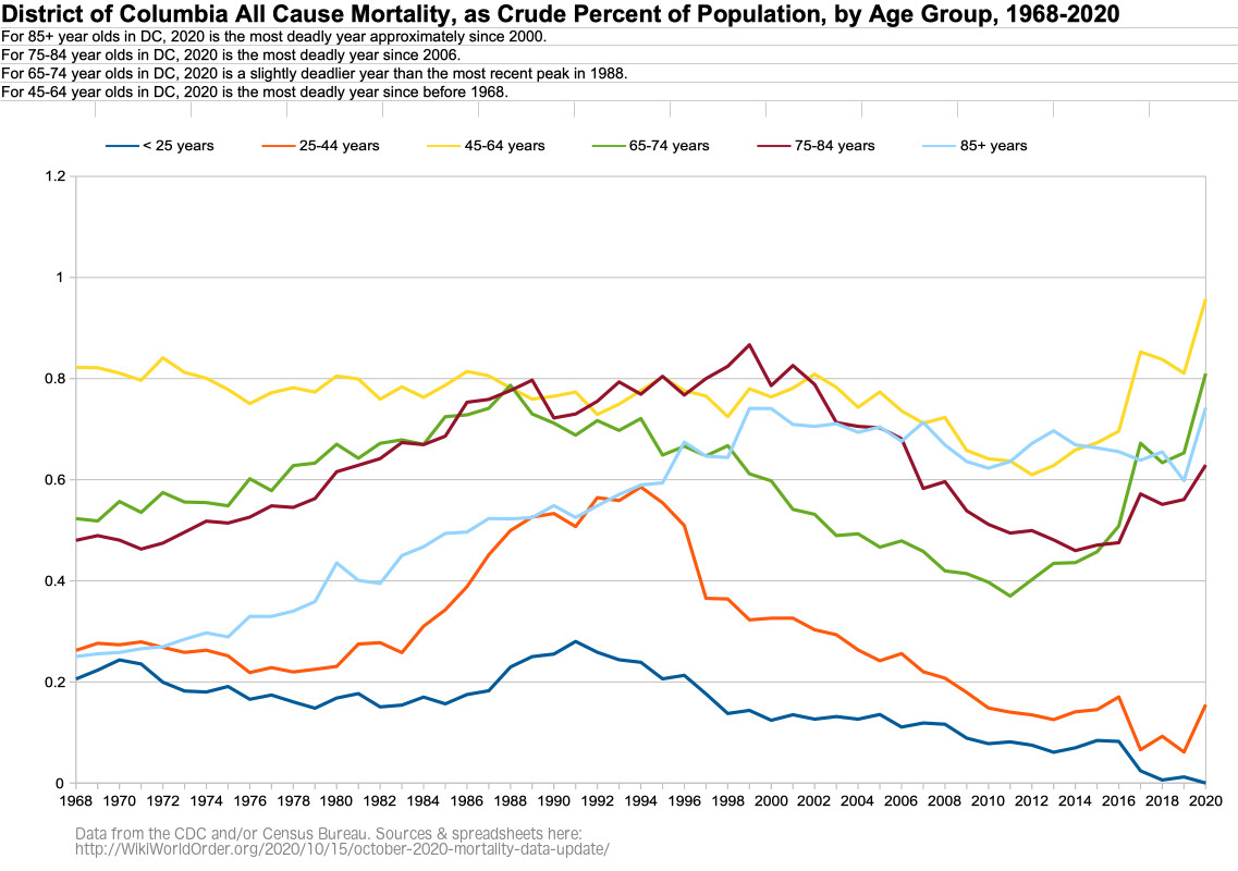
Figure DC-3: District of Columbia Age Groups as Percent of Population, 1968-2020
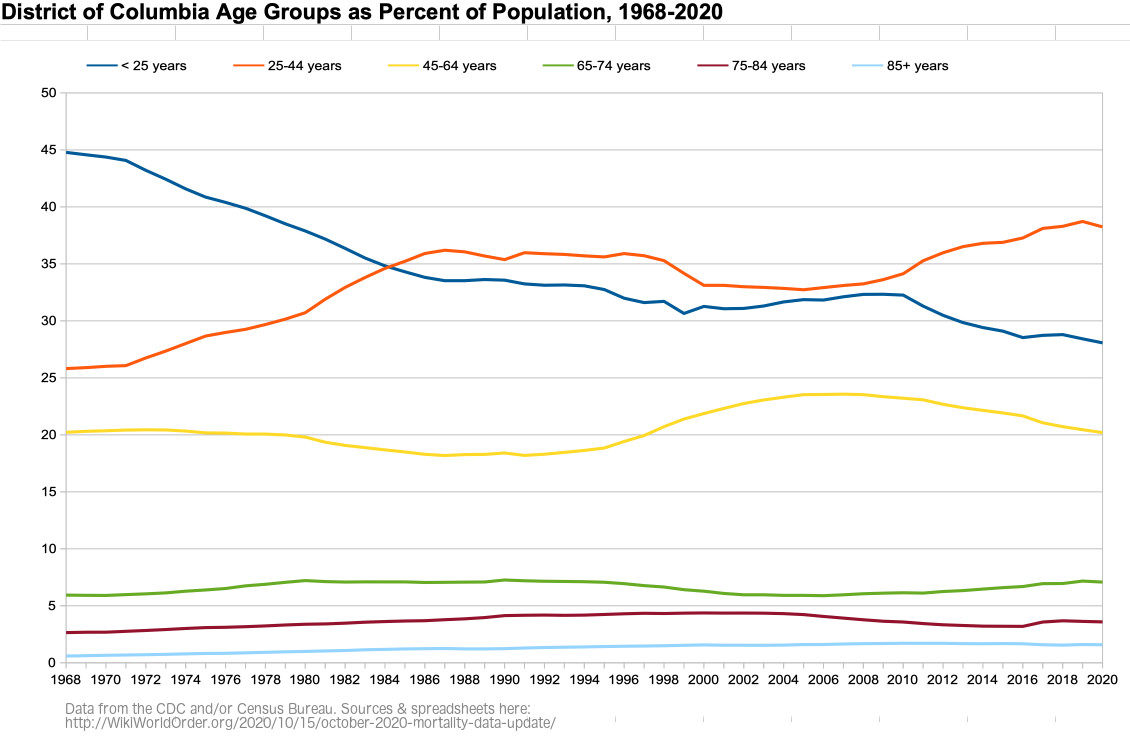
Figure DC-4: Weekly District of Columbia All Cause Mortality, Crude Rate Per Million, Sept-Aug 2015-2020
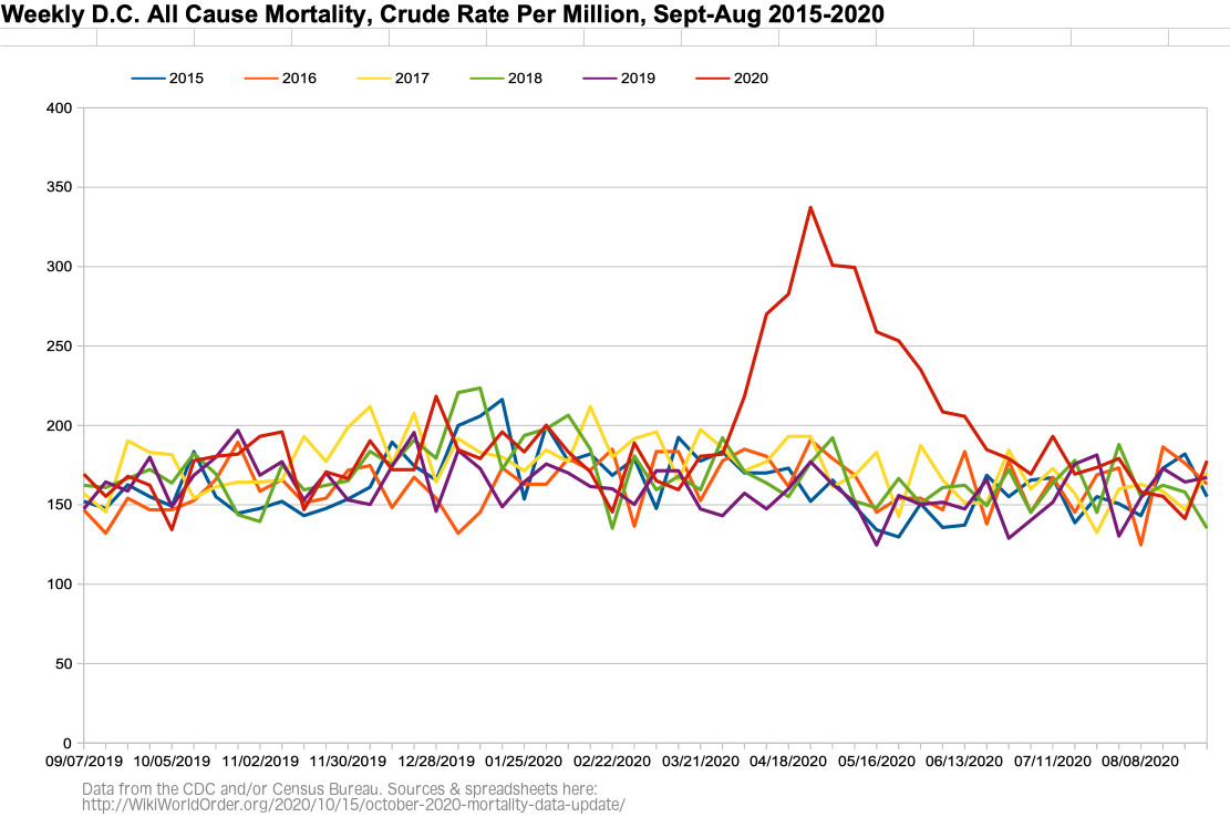
Figure DC-5: Weekly District of Columbia All Cause Mortality, Crude Rate Per Million, Sept 2019 – Aug 2020
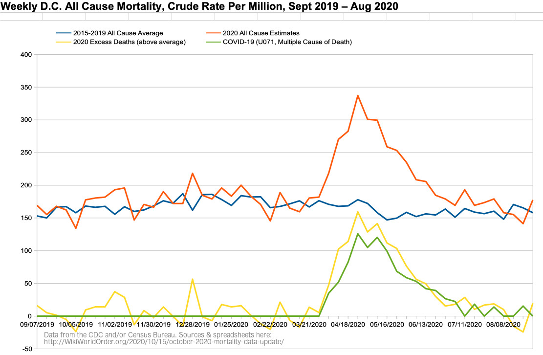
Figure DC-6: Weekly District of Columbia All Cause Mortality VS Imperial College Model, Crude Rate Per Million, Sept 2019 – Aug 2020
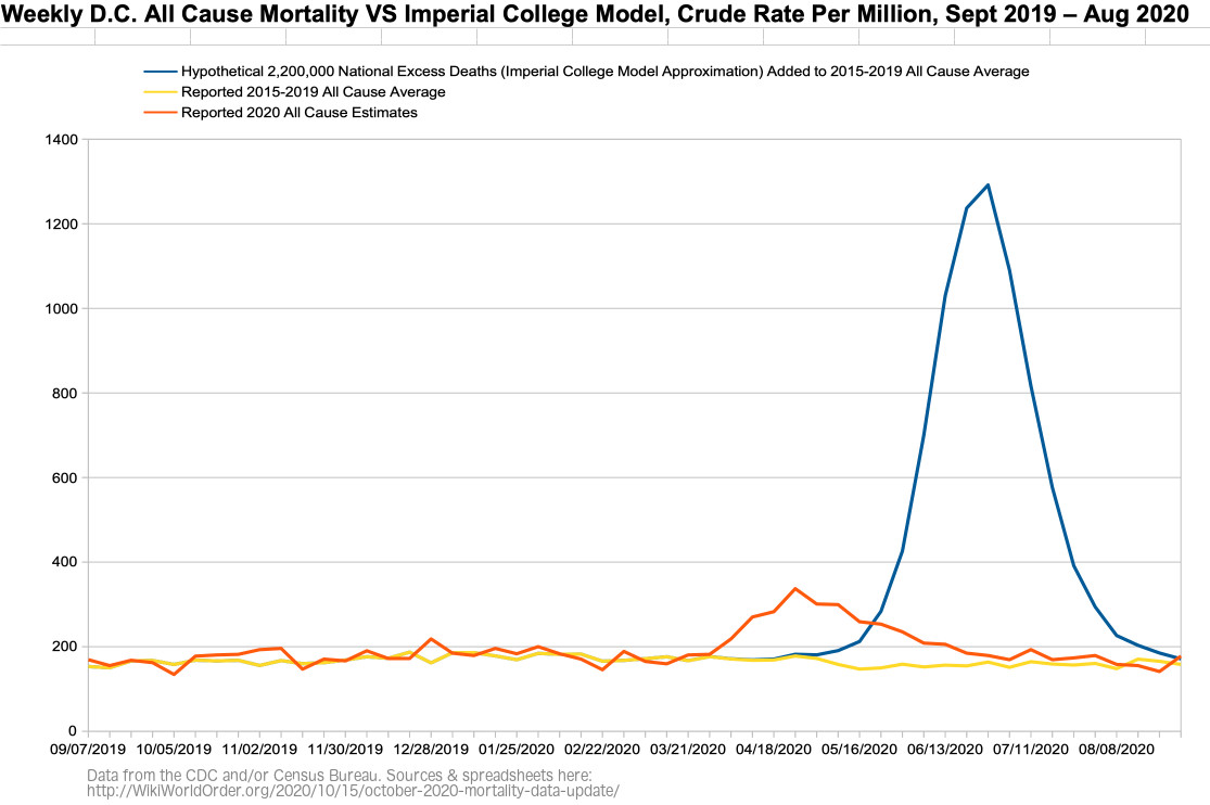
Figure DC-6b: Figure DC-6 with the Imperial College’s March Graphed Projections of “Critical care beds occupied per 100,0000 of population” with Different Interventions (graph added Dec 11)
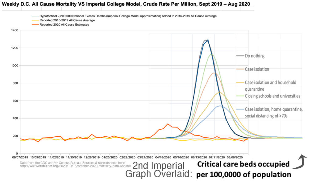
Figure DC-6c: Figure DC-6 with the Imperial College’s March Graphed Projections of “Critical care beds occupied per 100,0000 of population” with Different Interventions on Reported Data (graph added Dec 11)
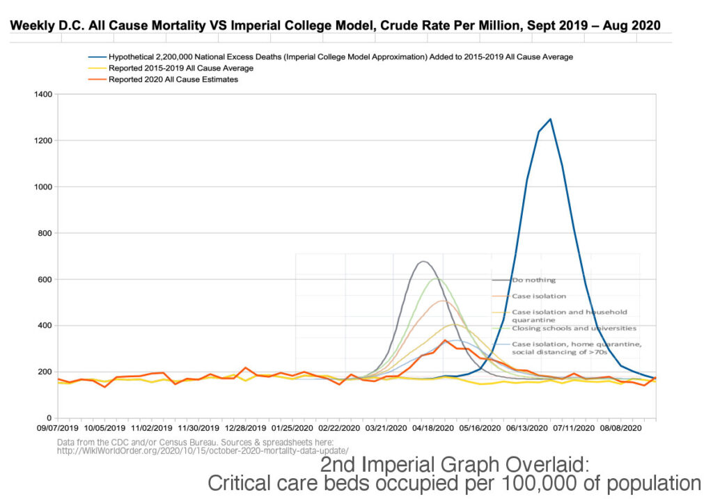
Figure DC-7: Weekly District of Columbia Number of Deaths, Excess and Expected (CDC screenshot)
(Related to “dry tinder” hypothesis.)
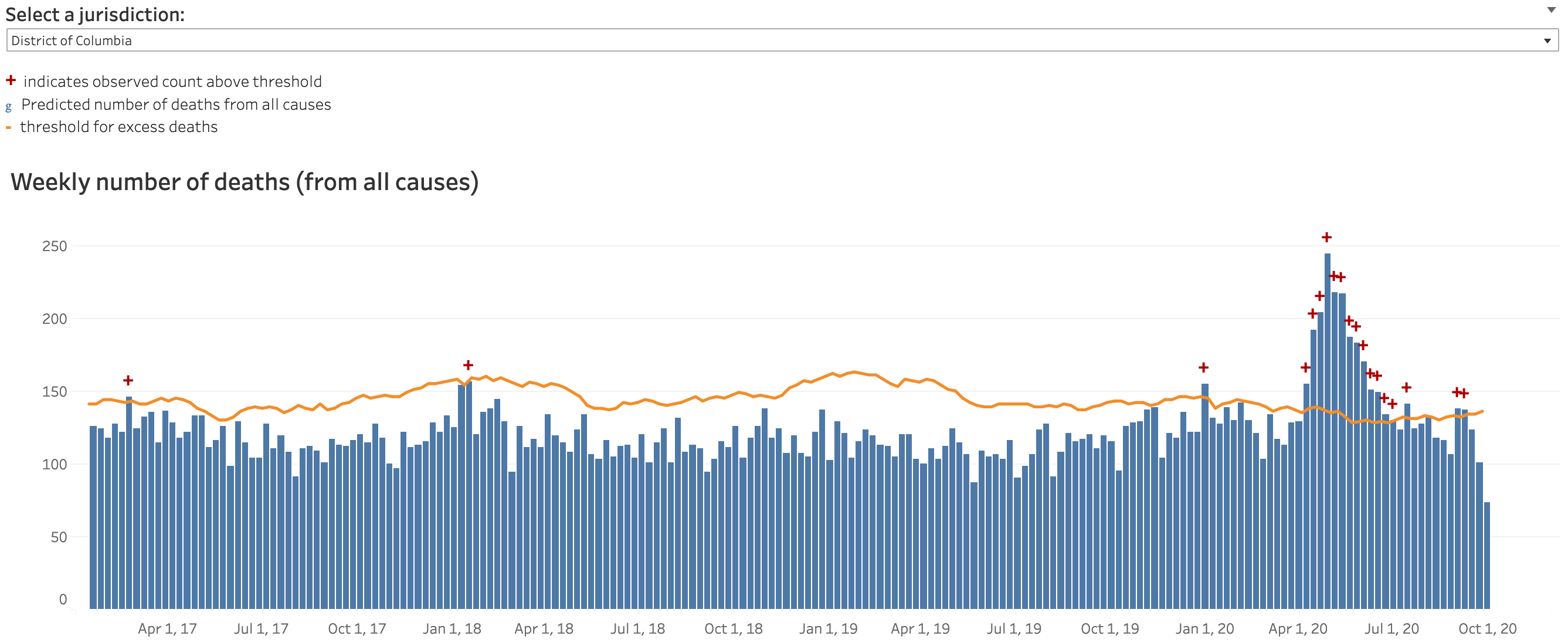
Figure DC-8: Daily New Cases in the District of Columbia (WorldOMeters.info screenshot)
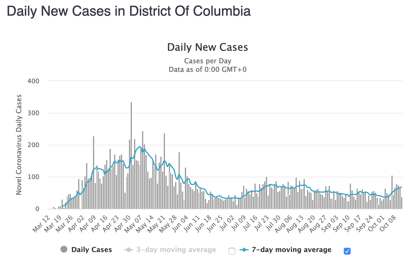
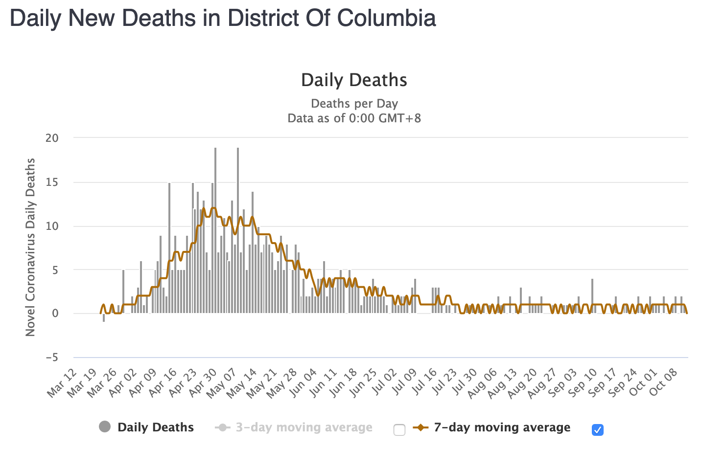
Figure DC-9: Daily New Deaths in the District of Columbia (WorldOMeters.info screenshot)
(Recently in “Casedemic” territory.)
Florida
Figure FL-1: Florida All Cause Mortality, as Crude Percent of Population, 1910-2020
2020 mortality is graphed here as Sept ’19 through Aug ’20, with a record high 229,436 deaths, or 1.05% of the population. According to the CDC, 2020 is Florida’s deadliest year since 1995.
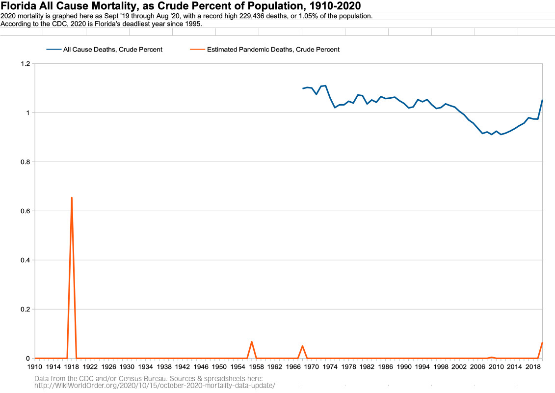
Figure FL-2: Florida All Cause Mortality, as Crude Percent of Population, by Age Group, 1968-2020
For 85+ year olds in Florida, 2020 is the most deadly year since 2010.
For 75-84 year olds in Florida, 2020 is the most deadly year since 2012.
For 65-74 year olds in Florida, 2020 is the most deadly year since 2005.
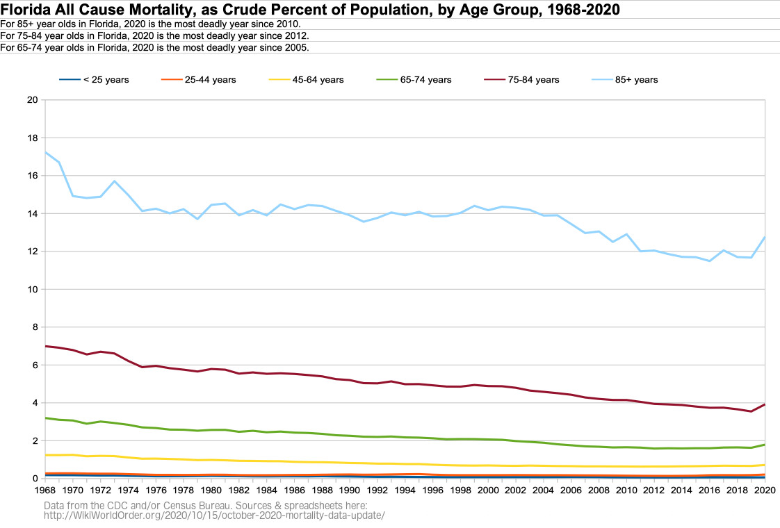
Figure FL-3: Florida Age Groups as Percent of Population, 1968-2020
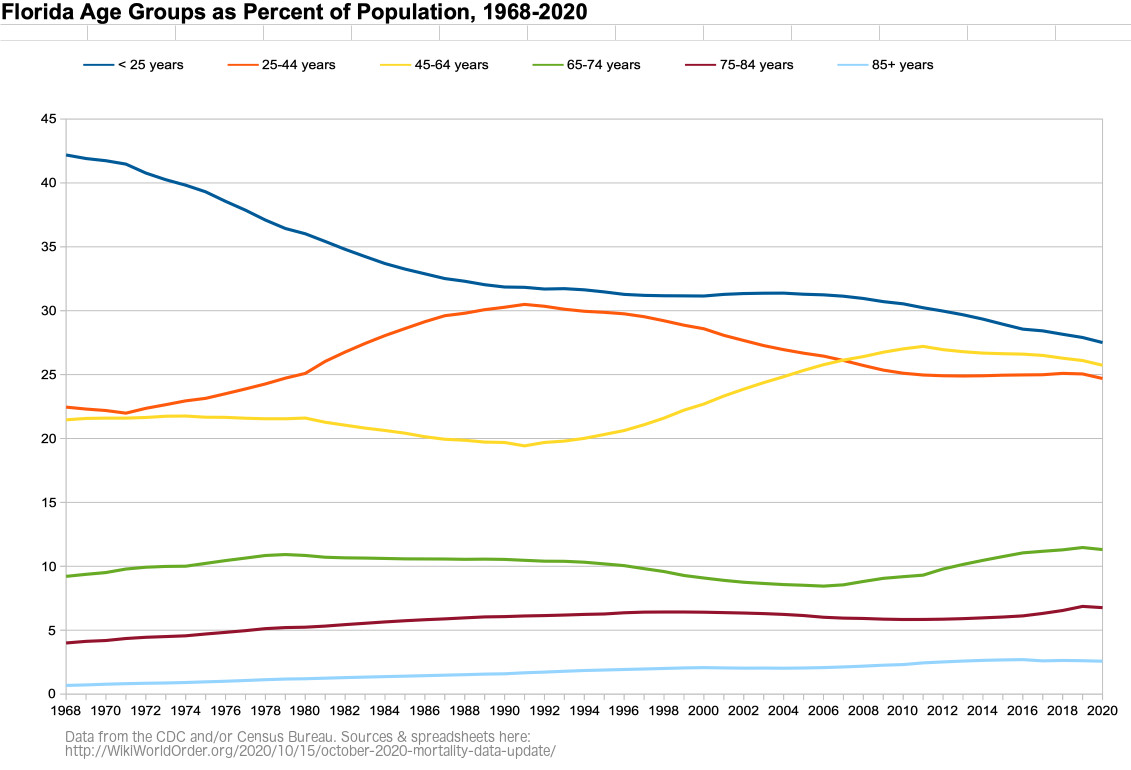
Figure FL-4: Weekly Florida All Cause Mortality, Crude Rate Per Million, Sept-Aug 2015-2020
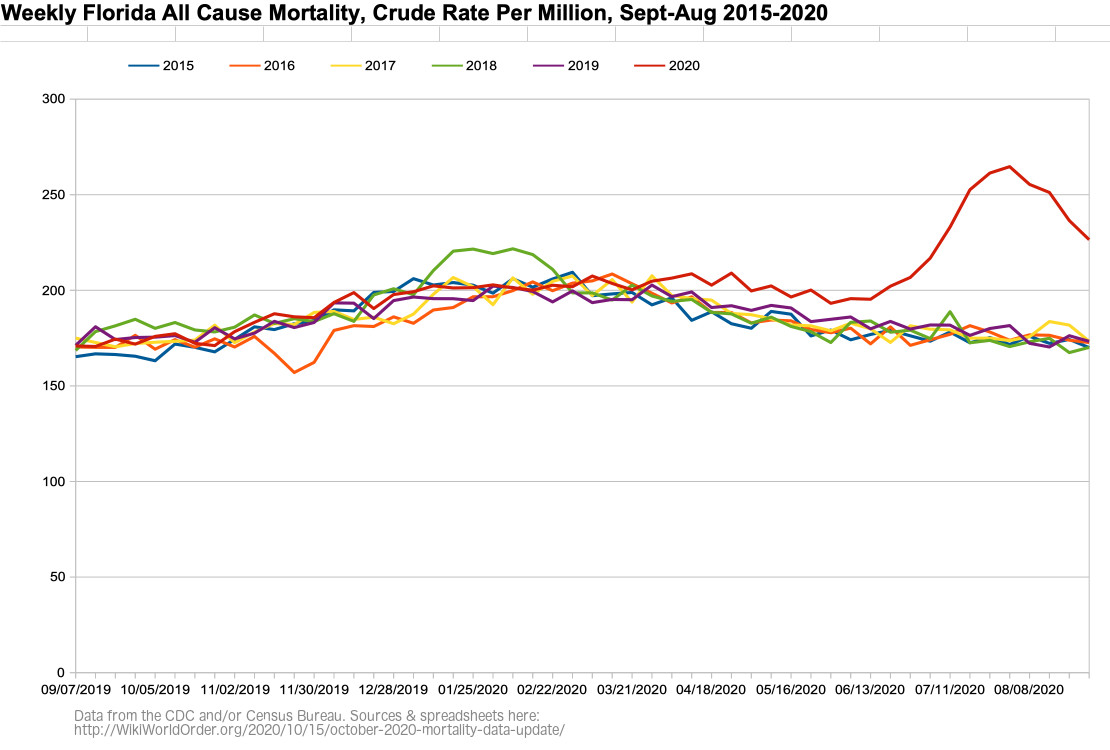
Figure FL-5: Weekly Florida All Cause Mortality, Crude Rate Per Million, Sept 2019 – Aug 2020
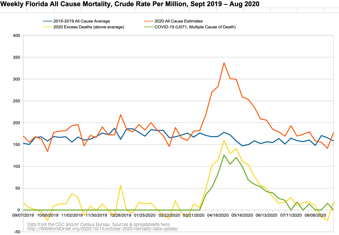
Figure FL-6: Weekly Florida All Cause Mortality VS Imperial College Model, Crude Rate Per Million, Sept 2019 – Aug 2020
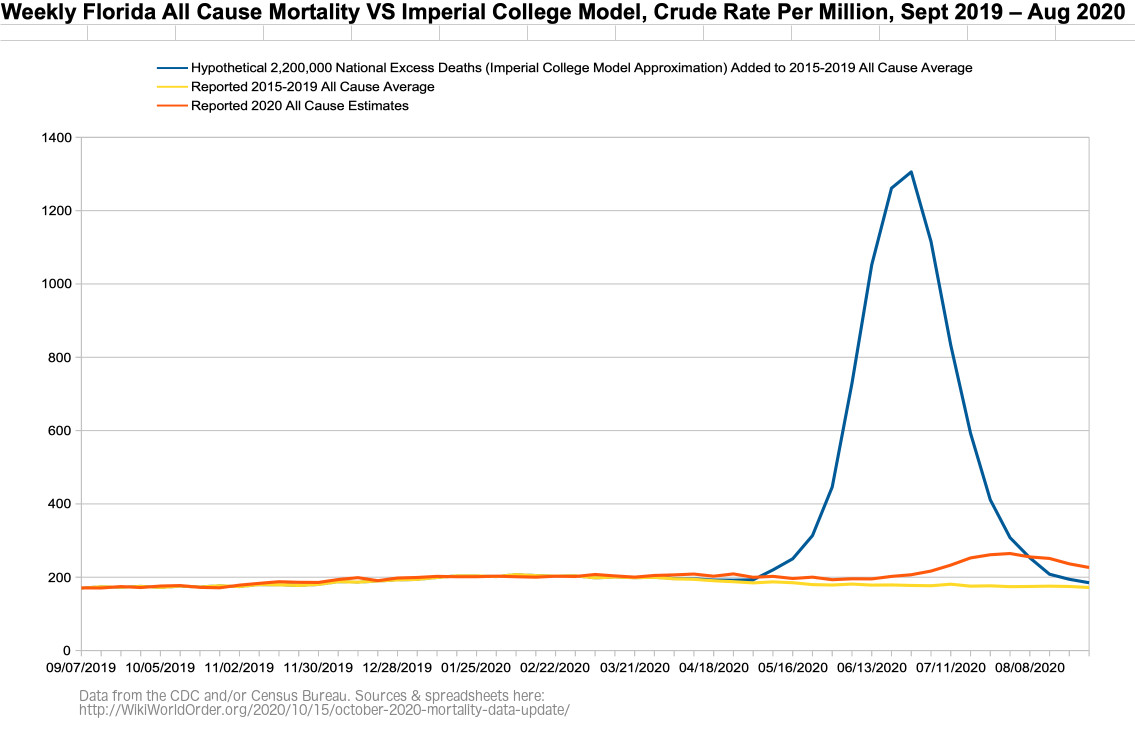
Figure FL-6b: Figure FL-6 with the Imperial College’s March Graphed Projections of “Critical care beds occupied per 100,0000 of population” with Different Interventions (graph added Dec 11)
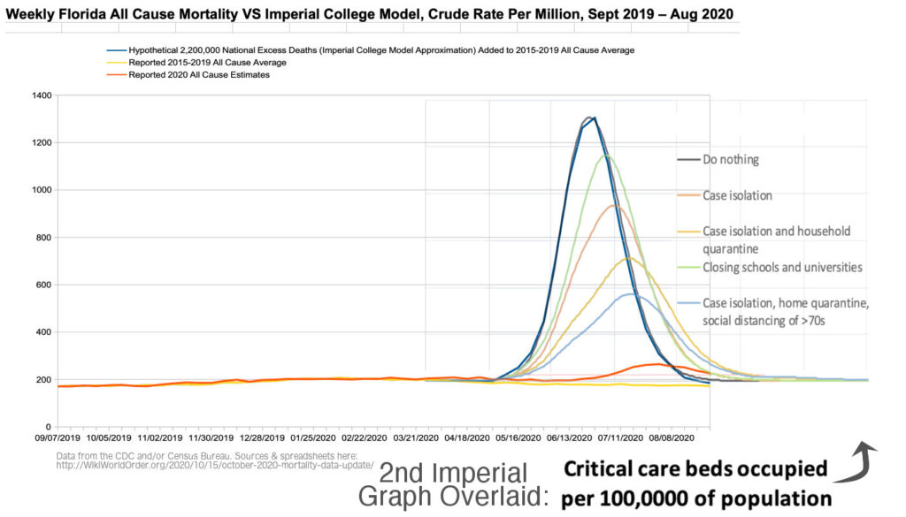
Figure FL-6c: Figure FL-6 with the Imperial College’s March Graphed Projections of “Critical care beds occupied per 100,0000 of population” with Different Interventions on Reported Data (graph added Dec 11)
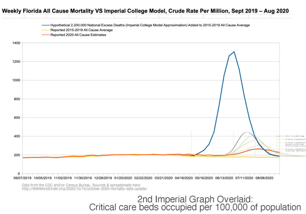
Figure FL-7: Weekly Florida Number of Deaths, Excess and Expected (CDC screenshot)
(Related to “dry tinder” hypothesis.)
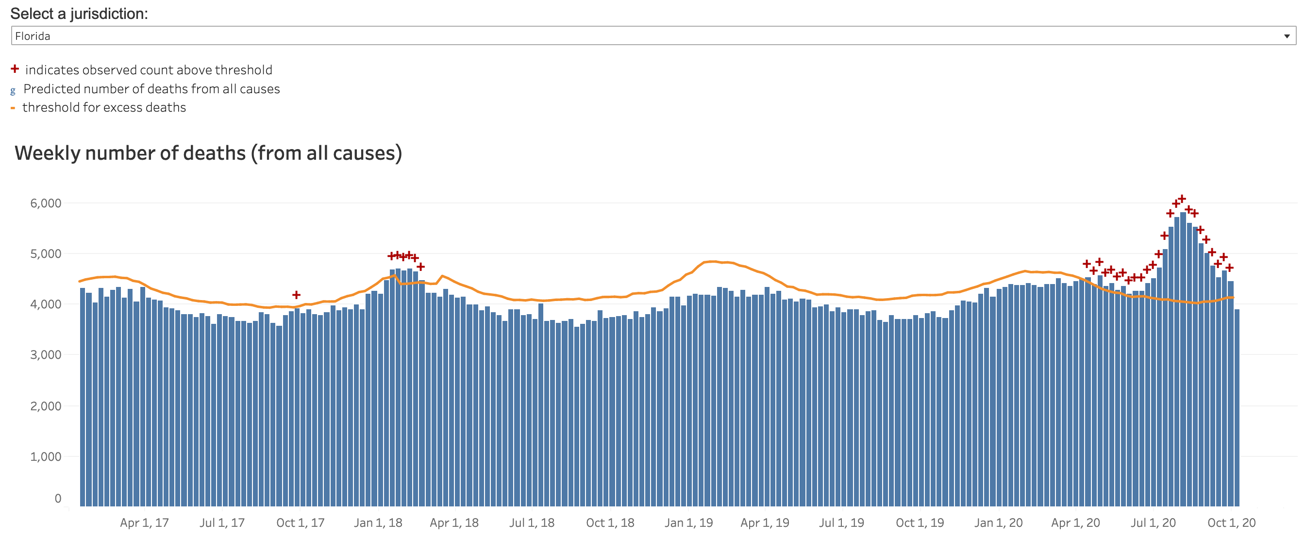
Figure FL-8: Daily New Cases in Florida (WorldOMeters.info screenshot)
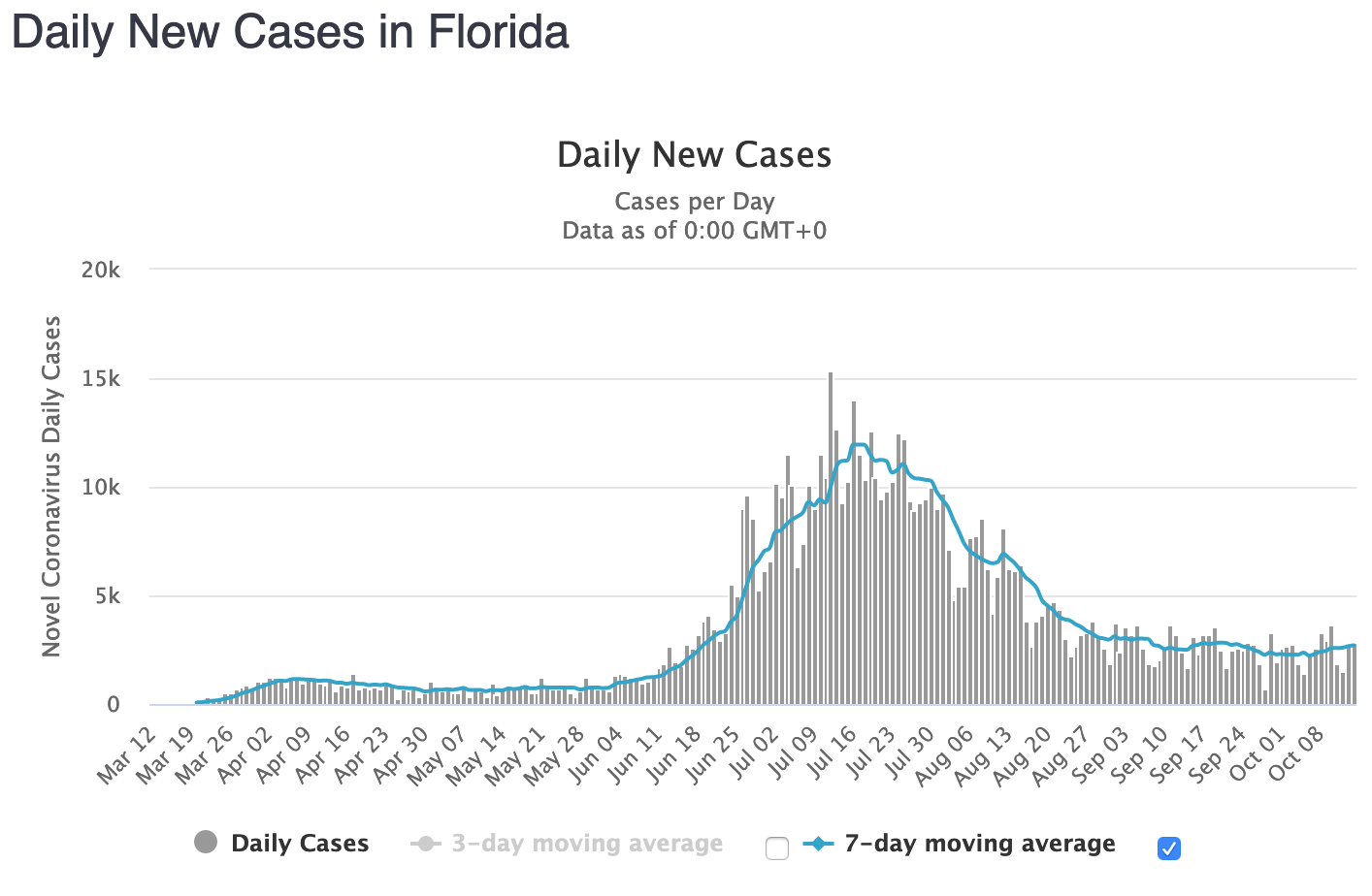
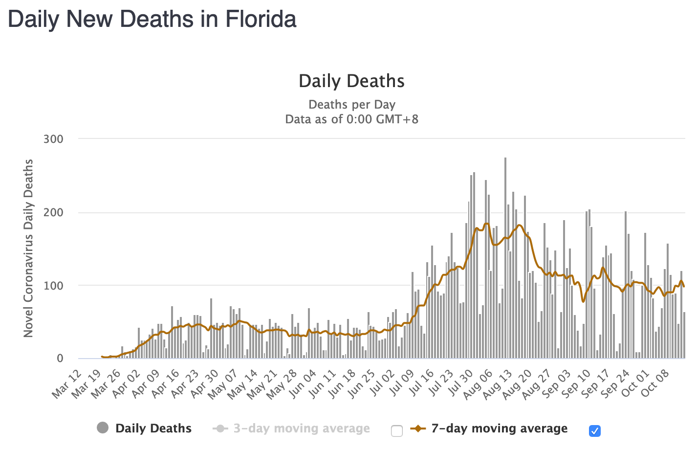
Figure FL-9: Daily New Deaths in Florida (WorldOMeters.info screenshot)
Arizona
Figure AZ-1: Arizona All Cause Mortality, as Crude Percent of Population, 1910-2020
2020 mortality is graphed here as Sept ’19 through Aug ’20, with a record high 70,196 deaths, or 0.95% of the population. According to the CDC, 2020 is Arizona’s deadliest year since before 1968.
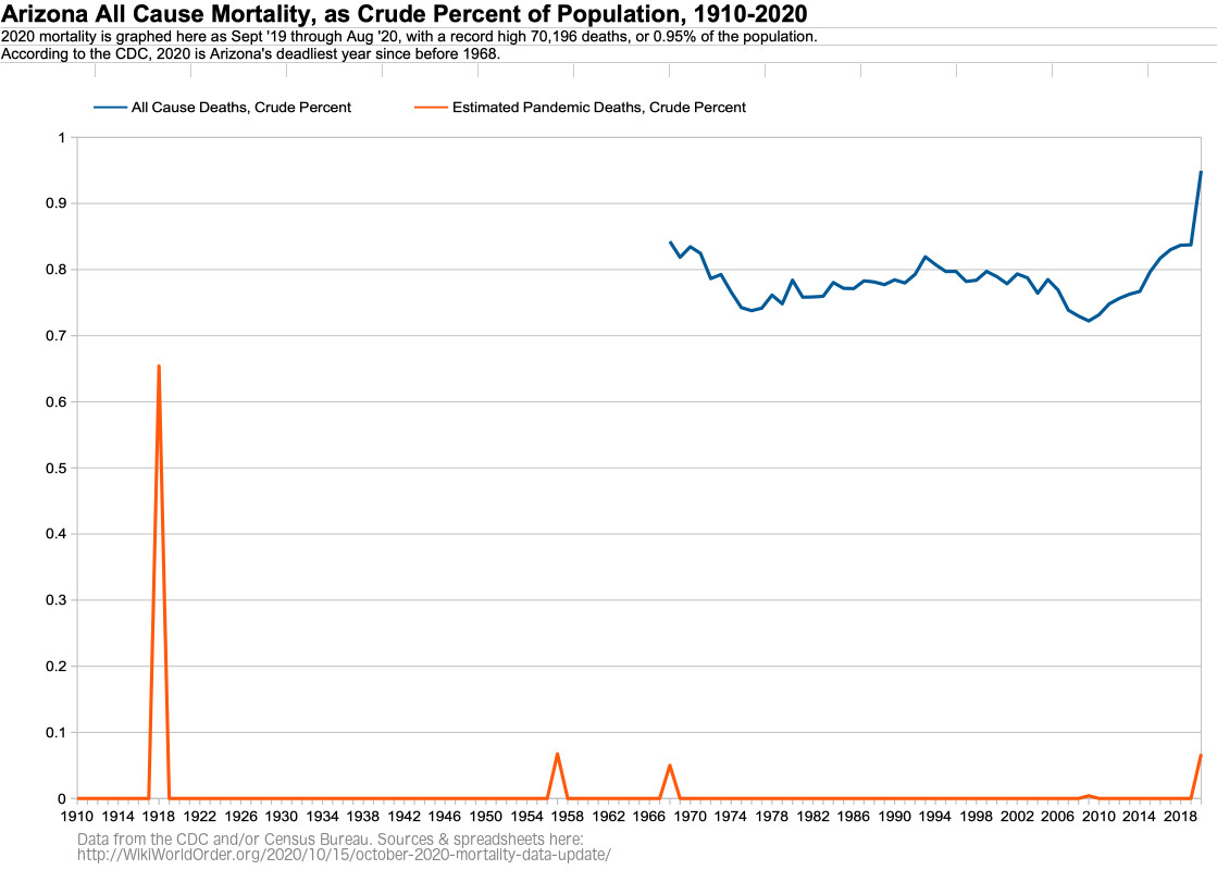
Figure AZ-2: Arizona All Cause Mortality, as Crude Percent of Population, by Age Group, 1968-2020
For 85+ year olds in Arizona, 2020 is the most deadly year since 2002.
For 75-84 year olds in Arizona, 2020 is the most deadly year since 2010.
For 65-74 year olds in Arizona, 2020 is the most deadly year since 2005.
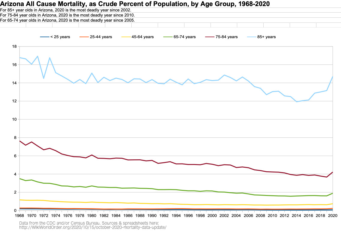
Figure AZ-3: Arizona Age Groups as Percent of Population, 1968-2020
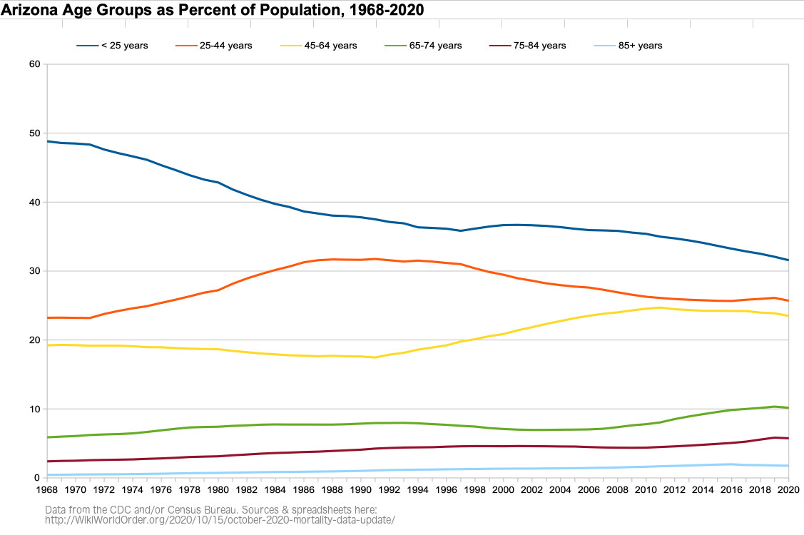
Figure AZ-4: Weekly Arizona All Cause Mortality, Crude Rate Per Million, Sept-Aug 2015-2020
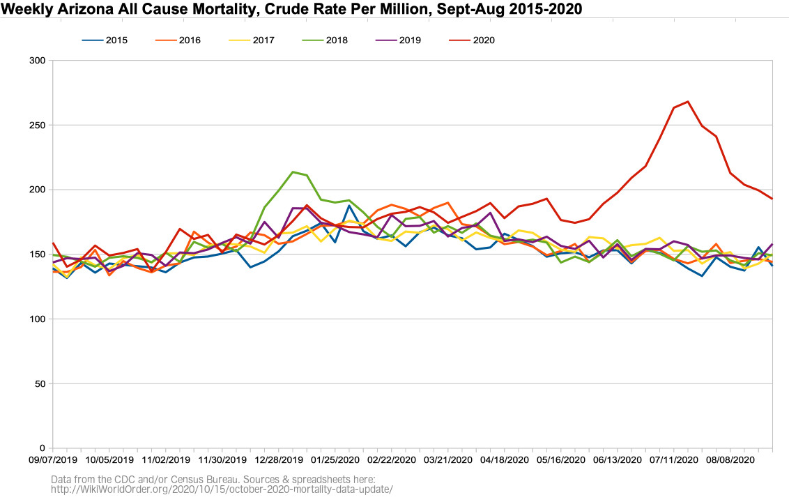
Figure AZ-5: Weekly Arizona All Cause Mortality, Crude Rate Per Million, Sept 2019 – Aug 2020
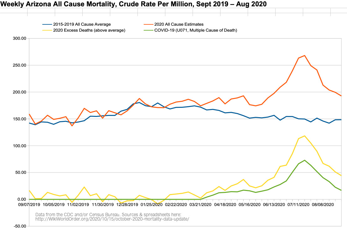
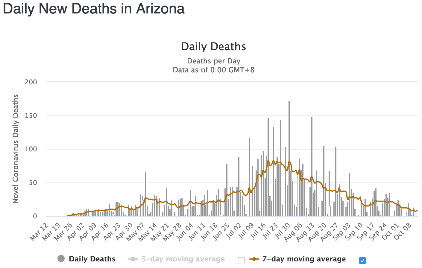
Figure AZ-6: Weekly Arizona All Cause Mortality VS Imperial College Model, Crude Rate Per Million, Sept 2019 – Aug 2020
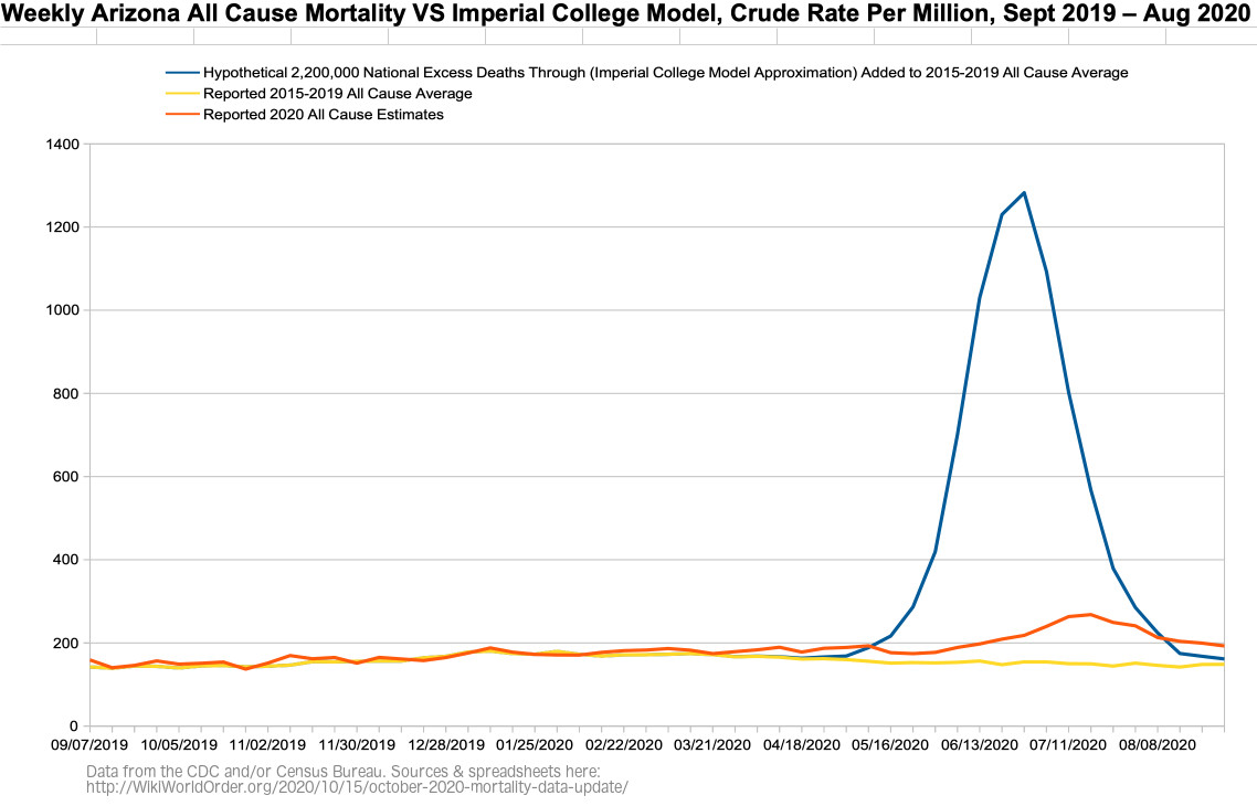
Figure AZ-6b: Figure AZ-6 with the Imperial College’s March Graphed Projections of “Critical care beds occupied per 100,0000 of population” with Different Interventions (graph added Dec 11)
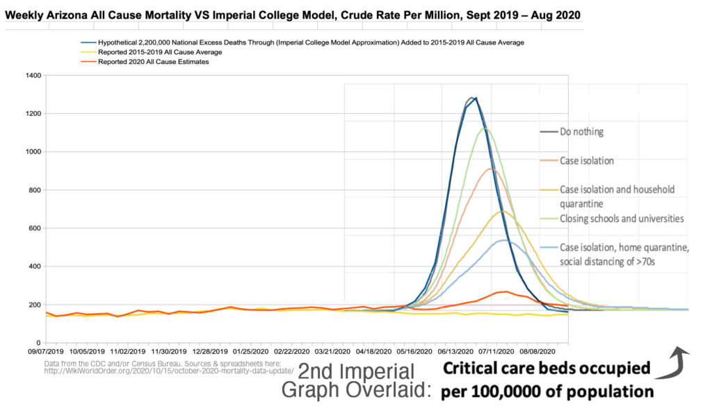
Figure AZ-6c: Figure AZ-6 with the Imperial College’s March Graphed Projections of “Critical care beds occupied per 100,0000 of population” with Different Interventions on Reported Data (graph added Dec 11)
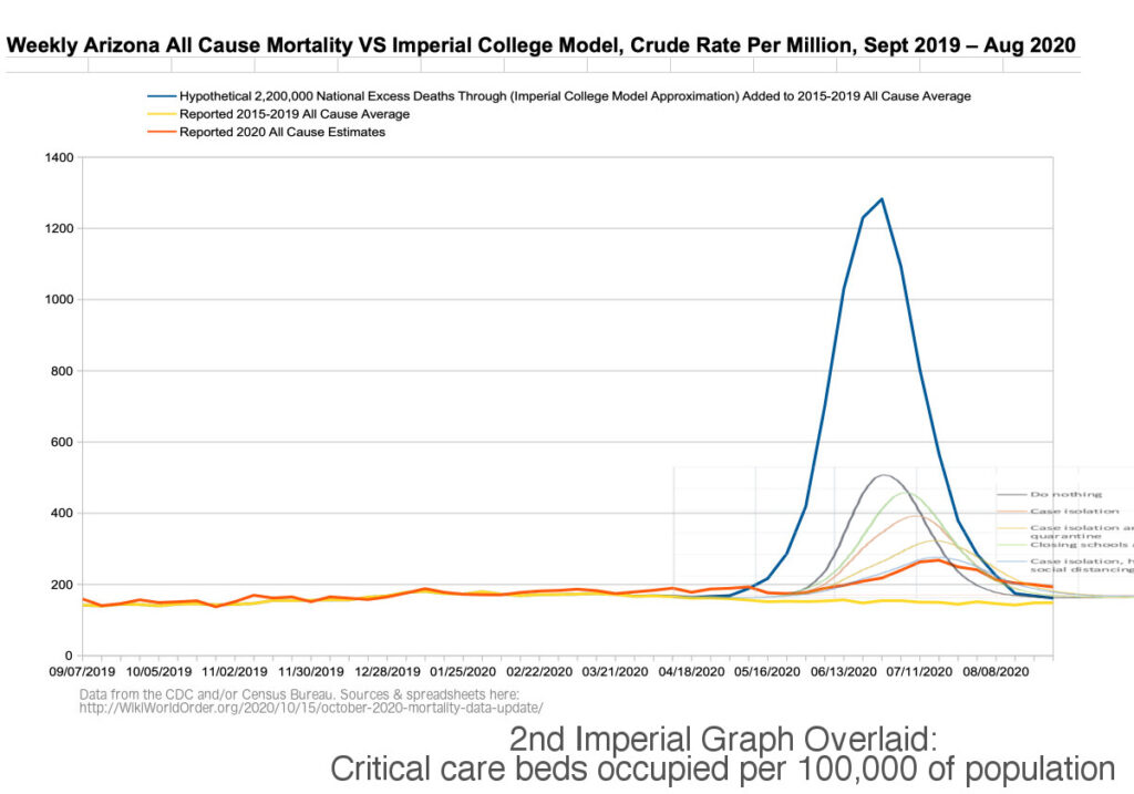
Figure AZ-7: Weekly Arizona Number of Deaths, Excess and Expected (CDC screenshot)
(Related to “dry tinder” hypothesis.)
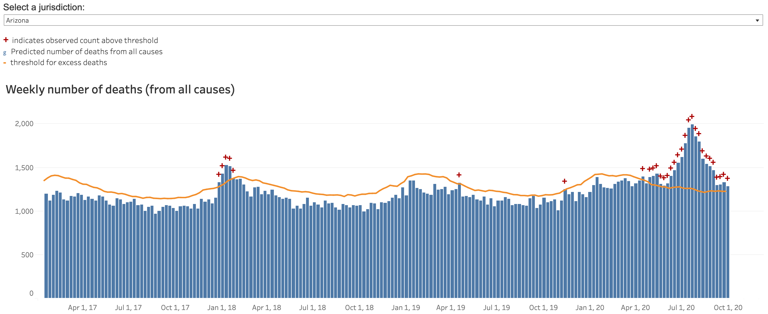
Figure AZ-8: Daily New Cases in Arizona (WorldOMeters.info screenshot)
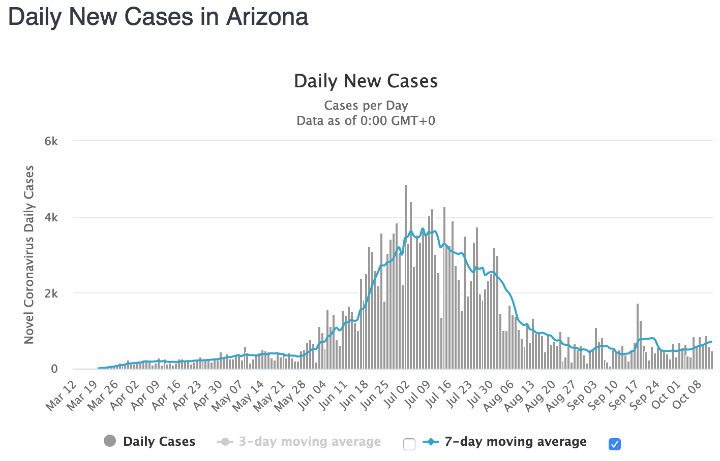
Figure AZ-9: Daily New Deaths in Arizona (WorldOMeters.info screenshot)
It’s harder than necessary to put live data in a greater context than the past five years. If pseudoscience continues to drive the policy makers who impose laws over me, then I’ll have to build software to track this layer of authoritarian technocracy. Please spare me of such work, society, there are hundreds of other gifts I would rather give you. ;-p <3
Graph Data Sources
All Cause Mortality Sources
1900-1960 From rate estimates, page 316, Table 53
https://www.cdc.gov/nchs/data/vsus/vsrates1940_60.pdf
1902-1967 Maryland
https://health.maryland.gov/vsa/Documents/HistoricalTrend_2018.pdf
1961-1967
https://www.cdc.gov/nchs/data/dvs/lead1900_98.pdf
1968-1978
https://wonder.cdc.gov/cmf-icd8.html
1979-1998
https://wonder.cdc.gov/cmf-icd9.html
1999-2016
https://wonder.cdc.gov/cmf-icd10.html
2017-2018
https://data.cdc.gov/NCHS/Weekly-Counts-of-Deaths-by-State-and-Select-Causes/3yf8-kanr
2019-2020
https://data.cdc.gov/NCHS/Weekly-Counts-of-Deaths-by-State-and-Select-Causes/muzy-jte6
Pandemic Estimate Sources
1918 Pandemic (H1N1 virus)
https://www.cdc.gov/flu/pandemic-resources/1918-pandemic-h1n1.html
1957-1958 Pandemic (H2N2 virus)
https://www.cdc.gov/flu/pandemic-resources/1957-1958-pandemic.html
1968 Pandemic (H3N2 virus)
https://www.cdc.gov/flu/pandemic-resources/1968-pandemic.html
2009 H1N1 Pandemic (H1N1pdm09 virus)
https://www.cdc.gov/flu/pandemic-resources/2009-h1n1-pandemic.html
2020 COVID-19
https://data.cdc.gov/NCHS/Weekly-Counts-of-Deaths-by-State-and-Select-Causes/muzy-jte6
Population Sources
1900-1967 United States
https://www2.census.gov/programs-surveys/popest/tables/1900-1980/national/totals/popclockest.txt
1902-1967 Maryland
https://health.maryland.gov/vsa/Documents/HistoricalTrend_2018.pdf
1968-2016
https://wonder.cdc.gov/cmf-icd8.html
2017
https://data.census.gov/cedsci/table?q=United%20States&g=0100000US&tid=ACSDP1Y2017.DP05
2018
https://data.census.gov/cedsci/table?q=United%20States&g=0100000US&tid=ACSDP1Y2018.DP05
2019
https://data.census.gov/cedsci/table?q=United%20States&g=0100000US&tid=ACSDP1Y2019.DP05
Dec 15 Spot Check
My Related Essays/Videos:
May 28: Science Denial? Rights Denial?
May 28: Drug Use and Pandemics as Public Health Issues
May 20: Governor Hogan’s Science-Based Health Policies: An Information Request Experiment
May 13: Revisiting Imperial Risk Assessments of COVID-19
May 10: Risk Assessment Update May 10 on U.S. COVID-19 Deaths
Apr 23: Clade X Quotes: The Governors’ Pandemic
Mar 29: Double-Edges of Exponential Scientism
Updated Statistics & Customizable Trend Graphs:

